Visualising AFL Grand Final History

I'm getting in early with the Grand Final postings.

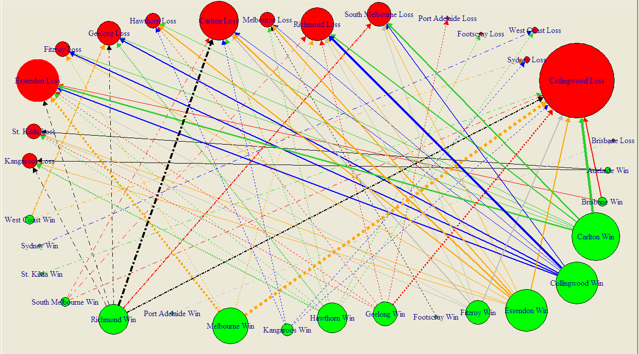
The diagram below summarises the results of all 111 Grand Finals in history, excluding the drawn Grand Finals of 1948 and 1977, and encodes information in the following ways:

  • Each circle represents a team. Teams can appear once or twice (or not at all) - as a red circle as Grand Final losers and as a green circle as Grand Final winners.
  • Circle size if proportional to frequency. So, for example, a big red circle, such as Collingwood's denotes a team that has lost a lot of Grand Finals.
  • Arrows join Grand Finalists and emanate from the winning team and terminate at the losing team. The wider the arrow, the more common the result.

No information is encoded in the fact that some lines are solid and some are dashed. I've just done that in an attempt to improve legibility. (You can get a PDF of this diagram here, which should be a little easier to read.)

2010 - Grand Final Results 1.png

I've chosen not to amalgamate the records of Fitzroy and the Lions, Sydney and South Melbourne, or Footscray and the Dogs (though this last decision, I'll admit, is harder to detect). I have though amalgamated the records of North Melbourne and the Roos since, to my mind, the difference there is one of name only.

The diagram rewards scrutiny. I'll just leave you with a few things that stood out for me:

  • Seventeen different teams have been Grand Final winners; sixteen have been Grand Final losers
  • Wins have been slightly more equitably shared around than losses: eight teams have pea-sized or larger green circles (Carlton, Collingwood, Essendon, Hawthorn, Melbourne, Richmond, Geelong and Fitzroy), six have red circles of similar magnitude (Collingwood, South Melbourne, Richmond, Carlton, Geelong and Essendon).
  • I recognise that my vegetable-based metric is inherently imprecise and dependent on where you buy your produce and whether it's fresh or frozen, but I feel that my point still stands.
  • You can almost feel the pain radiating from those red circles for the Pies, Dons and Blues. Pies fans don't even have the salve of a green circle of anything approaching compensatory magnitude.
  • Many results are once-only results, with the notable exceptions being Richmond's dominance over the Blues, the Pies' over Richmond, and the Blues over the Pies (who knew - football Grand Final results are intransitive?), as well as Melbourne's over the Dons and the Pies.

As I write this, the Saints v Dogs game has yet to be played, so we don't know who'll face Collingwood in the Grand Final.

If it turns out to be a Pies v Dogs Grand Final then we'll have nothing to go on, since these two teams have not previously met in a Grand Final, not even if we allow Footscray to stand-in for the Dogs.

A Pies v Saints Grand Final is only slightly less unprecedented. They've met once before in a Grand Final when the Saints were victorious by one point in 1966.

A Proposition Bet on the Game Margin

We've not had a proposition bet for a while, so here's the bet and a spiel to go with it:

"If the margin at quarter time is a multiple of 6 points I'll pay you $5; if it's not, you pay me a $1. If the two teams are level at quarter-time it's a wash and neither of us pay the other anything.

Now quarter-time margins are unpredictable, so the probability of the margin being a multiple of 6 is 1-in-6, so my offering you odds of 5/1 makes it a fair bet, right? Actually, since goals are worth six points, you've probably got the better of the deal, since you'll collect if both teams kick the same number of behinds in the quarter.

Deal?"

At first glance this bet might look reasonable, but it isn't. I'll take you through the mechanics of why, and suggest a few even more lucrative variations.

Firstly, taking out the drawn quarter scenario is important. Since zero is divisible by 6 - actually, it's divisible by everything but itself - this result would otherwise be a loser for the bet proposer. Historically, about 2.4% of games have been locked up at the end of the 1st quarter, so you want those games off the table.

You could take the high moral ground on removing the zero case too, because your probability argument implicitly assumes that you're ignoring zeroes. If you're claiming that the chances of a randomly selected number being divisible by 6 is 1-in-6 then it's as if you're saying something like the following:

"Consider all the possible margins of 12 goals or less at quarter time. Now twelve of those margins - 6, 12, 18, 24, 30, 36, 42, 48, 54, 60, 66 and 72 - are divisible by 6, and the other 60, excluding 0, are not. So the chances of the margin being divisible by 6 are 12-in-72 or 1-in-6."

In running that line, though, I'm making two more implicit assumptions, one fairly obvious and the other more subtle.

The obvious assumption I'm making is that every margin is equally likely. Demonstrably, it's not. Smaller margins are almost universally more frequent than larger margins. Because of this, the proportion of games with margins of 1 to 5 points is more than 5 times larger than the proportion of games with margins of exactly 6 points, the proportion of games with margins of 7 to 11 points is more than 5 times larger than the proportion of games with margins of exactly 12 points, and so on. It's this factor that, primarily, makes the bet profitable.

The tendency for higher margins to be less frequent is strong, but it's not inviolate. For example, historically more games have had a 5-point margin at quarter time than a 4-point margin, and more have had an 11-point margin than a 10-point margin. Nonetheless, overall, the declining tendency has been strong enough for the proposition bet to be profitable as I've described it.

Here is a chart of the frequency distribution of margins at the end of the 1st quarter.

The far-less obvious assumption in my earlier explanation of the fairness of the bet is that the bet proposer will have exactly five-sixths of the margins in his or her favour; he or she will almost certainly have more than this, albeit only slightly more.

This is because there'll be a highest margin and that highest margin is more likely not to be divisible by 6 than it is to be divisible by 6. The simple reason for this is, as we've already noted, that only one-sixth of all numbers are divisible by six.

So if, for example, the highest margin witnessed at quarter-time is 71 points (which, actually, it is), then the bet proposer has 60 margins in his or her favour and the bet acceptor has only 11. That's 5 more margins in the proposer's favour than the 5/1 odds require, even if every margin was equally likely.

The only way for the ratio of margins in favour of the proposer to those in favour of the acceptor to be exactly 5-to-1 would be for the highest margin to be an exact multiple of 6. In all other cases, the bet proposer has an additional edge (though to be fair it's a very, very small one - about 0.02%).

So why did I choose to settle the bet at the end of the 1st quarter and not instead, say, at the end of the game?

Well, as a game progresses the average margin tends to increase and that reduces the steepness of the decline in frequency with increasing margin size.

Here's the frequency distribution of margins as at game's end.

(As well as the shallower decline in frequencies, note how much less prominent the 1-point game is in this chart compared to the previous one. Games that are 1-point affairs are good for the bet proposer.)

The slower rate of decline when using 4th-quarter rather than 1st-quarter margins makes the wager more susceptible to transient stochastic fluctuations - or what most normal people would call 'bad luck' - so much so that the wager would have been unprofitable in just over 30% of the 114 seasons from 1897 to 2010, including a horror run of 8 losing seasons in 13 starting in 1956 and ending in 1968.

Across all 114 seasons taken as a whole though it would also have been profitable. If you take my proposition bet as originally stated and assume that you'd found a well-funded, if a little slow and by now aged, footballing friend who'd taken this bet since the first game in the first round of 1897, you'd have made about 12c per game from him or her on average. You'd have paid out the $5 about 14.7% of the time and collected the $1 the other 85.3% of the time.

Alternatively, if you'd made the same wager but on the basis of the final margin, and not the margin at quarter-time, then you'd have made only 7.7c per game, having paid out 15.4% of the time and collected the other 84.6% of the time.

One way that you could increase your rate of return, whether you choose the 1st- or 4th-quarter margin as the basis for determining the winner, would be to choose a divisor higher than 6. So, for example, you could offer to pay $9 if the margin at quarter-time was divisible by 10 and collect $1 if it wasn't. By choosing a higher divisor you virtually ensure that there'll be sufficient decline in the frequencies that your wager will be profitable.

In this last table I've provided the empirical data for the profitability of every divisor between 2 and 20. For a divisor of N the bet is that you'll pay $N-1 if the margin is divisible by N and you'll receive $1 if it isn't. The left column shows the profit if you'd settled the bet at quarter-time, and the right column if you'd settled it all full-time.

As the divisor gets larger, the proposer benefits from the near-certainty that the frequency of an exactly-divisible margin will be smaller than what's required for profitability; he or she also benefits more from the "extra margins" effect since there are likely to be more of them and, for the situation where the bet is being settled at quarter-time, these extra margins are more likely to include a significant number of games.

Consider, for example, the bet for a divisor of 20. For that wager, even if the proportion of games ending the quarter with margins of 20, 40 or 60 points is about one-twentieth the total proportion ending with a margin of 60 points or less, the bet proposer has all the margins from 61 to 71 points in his or her favour. That, as it turns out, is about another 11 games, or almost 0.1%. Every little bit helps.

All You Ever Wanted to Know About Favourite-Longshot Bias ...

Previously, on at least a few occasions, I've looked at the topic of the Favourite-Longshot Bias and whether or not it exists in the TAB Sportsbet wagering markets for AFL.

A Favourite-Longshot Bias (FLB) is said to exist when favourites win at a rate in excess of their price-implied probability and longshots win at a rate less than their price-implied probability. So if, for example, teams priced at $10 - ignoring the vig for now - win at a rate of just 1 time in 15, this would be evidence for a bias against longshots. In addition, if teams priced at $1.10 won, say, 99% of the time, this would be evidence for a bias towards favourites.

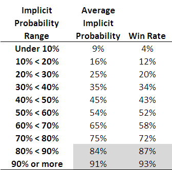
When I've considered this topic in the past I've generally produced tables such as the following, which are highly suggestive of the existence of such an FLB.

2010 - Favourite-Longshot Bias.png

Each row of this table, which is based on all games from 2006 to the present, corresponds to the results for teams with price-implied probabilities in a given range. The first row, for example, is for all those teams whose price-implied probability was less than 10%. This equates, roughly, to teams priced at $9.50 or more. The average implied probability for these teams has been 9%, yet they've won at a rate of only 4%, less than one-half of their 'expected' rate of victory.

As you move down the table you need to arrive at the second-last row before you come to one where the win rate exceed the expected rate (ie the average implied probability). That's fairly compelling evidence for an FLB.

This empirical analysis is interesting as far as it goes, but we need a more rigorous statistical approach if we're to take it much further. And heck, one of the things I do for a living is build statistical models, so you'd think that by now I might have thrown such a model at the topic ...

A bit of poking around on the net uncovered this paper which proposes an eminently suitable modelling approach, using what are called conditional logit models.

In this formulation we seek to explain a team's winning rate purely as a function of (the natural log of) its price-implied probability. There's only one parameter to fit in such a model and its value tells us whether or not there's evidence for an FLB: if it's greater than 1 then there is evidence for an FLB, and the larger it is the more pronounced is the bias.

When we fit this model to the data for the period 2006 to 2010 the fitted value of the parameter is 1.06, which provides evidence for a moderate level of FLB. The following table gives you some idea of the size and nature of the bias.

2010 - Favourite-Longshot Bias - Conditional Logit.png

The first row applies to those teams whose price-implied probability of victory is 10%. A fair-value price for such teams would be $10 but, with a 6% vig applied, these teams would carry a market price of around $9.40. The modelled win rate for these teams is just 9%, which is slightly less than their implied probability. So, even if you were able to bet on these teams at their fair-value price of $10, you'd lose money in the long run. Because, instead, you can only bet on them at $9.40 or thereabouts, in reality you lose even more - about 16c in the dollar, as the last column shows.

We need to move all the way down to the row for teams with 60% implied probabilities before we reach a row where the modelled win rate exceeds the implied probability. The excess is not, regrettably, enough to overcome the vig, which is why the rightmost entry for this row is also negative - as, indeed, it is for every other row underneath the 60% row.

Conclusion: there has been an FLB on the TAB Sportsbet market for AFL across the period 2006-2010, but it hasn't been generally exploitable (at least to level-stake wagering).

The modelling approach I've adopted also allows us to consider subsets of the data to see if there's any evidence for an FLB in those subsets.

I've looked firstly at the evidence for FLB considering just one season at a time, then considering only particular rounds across the five seasons.

2010 - Favourite-Longshot Bias - Year and Round.png

So, there is evidence for an FLB for every season except 2007. For that season there's evidence of a reverse FLB, which means that longshots won more often than they were expected to and favourites won less often. In fact, in that season, the modelled success rate of teams with implied probabilities of 20% or less was sufficiently high to overcome the vig and make wagering on them a profitable strategy.

That year aside, 2010 has been the year with the smallest FLB. One way to interpret this is as evidence for an increasing level of sophistication in the TAB Sportsbet wagering market, from punters or the bookie, or both. Let's hope not.

Turning next to a consideration of portions of the season, we can see that there's tended to be a very mild reverse FLB through rounds 1 to 6, a mild to strong FLB across rounds 7 to 16, a mild reverse FLB for the last 6 rounds of the season and a huge FLB in the finals. There's a reminder in that for all punters: longshots rarely win finals.

Lastly, I considered a few more subsets, and found:

  • No evidence of an FLB in games that are interstate clashes (fitted parameter = 0.994)
  • Mild evidence of an FLB in games that are not interstate clashes (fitted parameter = 1.03)
  • Mild to moderate evidence of an FLB in games where there is a home team (fitted parameter = 1.07)
  • Mild to moderate evidence of a reverse FLB in games where there is no home team (fitted parameter = 0.945)

FLB: done.

Divining the Bookie Mind: Singularly Difficult

It's fun this time of year to mine the posted TAB Sportsbet markets in an attempt to glean what their bookie is thinking about the relative chances of the teams in each of the four possible Grand Final pairings.

Three markets provide us with the relevant information: those for each of the two Preliminary Finals, and that for the Flag.

From these markets we can deduce the following about the TAB Sportsbet bookie's current beliefs (making my standard assumption that the overround on each competitor in a contest is the same, which should be fairly safe given the range of probabilities that we're facing with the possible exception of the Dogs in the Flag market):

  • The probability of Collingwood defeating Geelong this week is 52%
  • The probability of St Kilda defeating the Dogs this week is 75%
  • The probability of Collingwood winning the Flag is about 34%
  • The probability of Geelong winning the Flag is about 32%
  • The probability of St Kilda winning the Flag is about 27%
  • The probability of the Western Bulldogs winning the Flag is about 6%

(Strictly speaking, the last probability is redundant since it's implied by the three before it.)

What I'd like to know is what these explicit probabilities imply about the implicit probabilities that the TAB Sportsbet bookie holds for each of the four possible Grand Final matchups - that is for the probability that the Pies beat the Dogs if those two teams meet in the Grand Final; that the Pies beat the Saints if, instead, that pair meet; and so on for the two matchups involving the Cats and the Dogs, and the Cats and the Saints.

It turns out that the six probabilities listed above are insufficient to determine a unique solution for the four Grand Final probabilities I'm after - in mathematical terms, the relevant system that we need to solve is singular.

That system is (approximately) the following four equations, which we can construct on the basis of the six known probabilities and the mechanics of which team plays which other team this week and, depending on those results, in the Grand Final: 

  • 52% x Pr(Pies beat Dogs) + 48% x Pr(Cats beat Dogs) = 76%
  • 52% x Pr(Pies beat Saints) + 48% x Pr(Cats beat Saints) = 63.5%
  • 75% x Pr(Pies beat Saints) + 25% x Pr(Pies beat Dogs) = 66%
  • 75% x Pr(Cats beat Saints) + 25% x Pr(Cats beat Dogs) = 67.5%

(If you've a mathematical bent you'll readily spot the reason for the singularity in this system of equations: the coefficients in every equation sum to 1, as they must since they're complementary probabilities.)

Whilst there's not a single solution to those four equations - actually there's an infinite number of them, so you'll be relieved to know that I won't be listing them all here - the fact that probabilities must lie between 0 and 1 puts constraints on the set of feasible solutions and allows us to bound the four probabilities we're after.

So, I can assert that, as far as the TAB Sportsbet bookie is concerned:

  • The probability that Collingwood would beat St Kilda if that were the Grand Final matchup - Pr(Pies beats Saints) in the above - is between about 55% and 70%
  • The probability that Collingwood would beat the Dogs if that were the Grand Final matchup is higher than 54% and, of course, less than or equal to 100%.
  • The probability that Geelong would beat St Kilda if that were the Grand Final matchup is between 57% and 73%
  • The probability that Geelong would beat the Dogs if that were the Grand Final matchup is higher than 50.5% and less than or equal to 100%.

One straightforward implication of these assertions is that the TAB Sportsbet bookie currently believes the winner of the Pies v Cats game on Friday night will start as favourite for the Grand Final. That's an interesting conclusion when you recall that the Saints beat the Cats in week 1 of the Finals.

We can be far more definitive about the four probabilities if we're willing to set the value of any one of them, as this then uniquely defines the other three.

So, let's assume that the bookie thinks that the probability of Collingwood defeating the Dogs if those two make the Grand Final is 80%. Given that, we can say that the bookie must also believe that:

  • The probability that Collingwood would beat St Kilda if that were the Grand Final matchup is about 61%.
  • The probability that Geelong would beat St Kilda if that were the Grand Final matchup, is about 66%.
  • The probability that Geelong would beat the Dogs if that were the Grand Final matchup is higher than 72%.

Together, that forms a plausible set of probabilities, I'd suggest, although the Geelong v St Kilda probability is higher than I'd have guessed. The only way to reduce that probability though is to also reduce the probability of the Pies beating the Dogs.

If you want to come up with your own rough numbers, choose your own probability for the Pies v Dogs matchup and then adjust the other three probabilities using the four equations above or using the following approximation:

For every 5% that you add to the Pies v Dogs probability:

  • subtract 1.5% from the Pies v Saints probability
  • add 2% to the Cats v Saints probability, and
  • subtract 5.5% from the Cats v Dogs probability

If you decide to reduce rather than increase the probability for the Pies v Dogs game then move the other three probabilities in the direction opposite to that prescribed in the above. Also, remember that you can't drop the Pies v Dogs probability below 55% nor raise it above 100% (no matter how much better than the Dogs you think the Pies are, the laws of probability must still be obeyed.)

Alternatively, you can just use the table below if you're happy to deal only in 5% increments of the Pies v Dogs probability. Each row corresponds to a set of the four probabilities that is consistent with the TAB Sportsbet markets as they currently stand.

2010 - Grand Final Probabilities.png

I've highlighted the four rows in the table that I think are the ones most likely to match the actual beliefs of the TAB Sportsbet bookie. That narrows each of the four probabilities into a 5-15% range.

At the foot of the table I've then converted these probability ranges into equivalent fair-value price ranges. You should take about 5% off these prices if you want to obtain likely market prices.

Just Because You're Stable, Doesn't Mean You're Normal

As so many traders discovered to their individual and often, regrettably, our collective cost over the past few years, betting against longshots, deliberately or implicitly, can be a very lucrative gig until an event you thought was a once-in-a-virtually-never affair crops up a couple of times in a week. And then a few more times again after that.

To put a footballing context on the topic, let's imagine that a friend puts the following proposition bet to you: if none of the first 100 home-and-away games next season includes one with a handicap-adjusted margin (HAM) for the home team of -150 or less he'll pay you $100; if there is one or more games with a HAM of -150 or less, however, you pay him $10,000.

For clarity, by "handicap-adjusted margin" I mean the number that you get if you subtract the away team's score from the home team's score and then add the home team's handicap. So, for example, if the home team was a 10.5 point favourite but lost 100-75, then the handicap adjusted margin would be 75-100-10.5, or -35.5 points.

A First Assessment

At first blush, does the bet seem fair?

We might start by relying on the availability heuristic and ask ourselves how often we can recall a game that might have produced a HAM of -150 or less. To make that a tad more tangible, how often can you recall a team losing by more than 150 points when it was roughly an equal favourite or by, say, 175 points when it was a 25-point underdog?

Almost never, I'd venture. So, offering 100/1 odds about this outcome occurring once or more in 100 games probably seems attractive.

Ahem ... the data?

Maybe you're a little more empirical than that and you'd like to know something about the history of HAMs. Well, since 2006, which is a period covering just under 1,000 games and that spans the entire extent - the whole hog, if you will - of my HAM data, there's never been a HAM under -150.

One game produced a -143.5 HAM; the next lowest after that was -113.5. Clearly then, the HAM of -143.5 was an outlier, and we'd need to see another couple of scoring shots on top of that effort in order to crack the -150 mark. That seems unlikely.

In short, we've never witnessed a HAM of -150 or less in about 1,000 games. On that basis, the bet's still looking good.

But didn't you once tell me that HAMs were Normal?

Before we commit ourselves to the bet, let's consider what else we know about HAMs.

Previously, I've claimed that HAMs seemed to follow a normal distribution and, in fact, the HAM data comfortably passes the Kolmogorov-Smirnov test of Normality (one of the few statistical tests I can think of that shares at least part of its name with the founder of a distillery).

Now technically the HAM data's passing this test means only that we can't reject the null hypothesis that it follows a Normal distribution, not that we can positively assert that it does. But given the ubiquity of the Normal distribution, that's enough prima facie evidence to proceed down this path of enquiry.

To do that we need to calculate a couple of summary statistics for the HAM data. Firstly, we need to calculate the mean, which is +2.32 points, and then we need to calculate the standard deviation, which is 36.97 points. A HAM of -150 therefore represents an event approximately 4.12 standard deviations from the mean.

If HAMs are Normal, that's certainly a once-in-a-very-long-time event. Specifically, it's an event we should expect to see only about every 52,788 games, which, to put it in some context, is almost exactly 300 times the length of the 2010 home-and-away season.

With a numerical estimate of the likelihood of seeing one such game we can proceed to calculate the likelihood of seeing one or more such game within the span of 100 games. The calculation is 1-(1-1/52,788)^100 or 0.19%, which is about 525/1 odds. At those odds you should expect to pay out that $10,000 about 1 time in 526, and collect that $100 on the 525 other occasions, which gives you an expected profit of $80.81 every time you take the bet.

That still looks like a good deal.

Does my tail look fat in this?

This latest estimate carries all the trappings of statistically soundness, but it does hinge on the faith we're putting in that 1 in 52,788 estimate, which, in turn hinges on our faith that HAMs are Normal. In the current instance this faith needs to hold not just in the range of HAMs that we see for most games - somewhere in the -30 to +30 range - but way out in the arctic regions of the distribution rarely seen by man, the part of the distribution that is technically called the 'tails'.

There are a variety of phenomena that can be perfectly adequately modelled by a Normal distribution for most of their range - financial returns are a good example - but that exhibit what are called 'fat tails', which means that extreme values occur more often than we would expect if the phenomenon faithfully followed a Normal distribution across its entire range of potential values. For most purposes 'fat tails' are statistically vestigial in their effect - they're an irrelevance. But when you're worried about extreme events, as we are in our proposition bet, they matter a great deal.

A class of distributions that don't get a lot of press - probably because the branding committee that named them clearly had no idea - but that are ideal for modelling data that might have fat tails are the Stable Distributions. They include the Normal Distribution as a special case - Normal by name, but abnormal within its family.

If we fit (using Maximum Likelihood Estimation if you're curious) a Stable Distribution to the HAM data we find that the best fit corresponds to a distribution that's almost Normal, but isn't quite. The apparently small difference in the distributional assumption - so small that I abandoned any hope of illustrating the difference with a chart - makes a huge difference in our estimate of the probability of losing the bet. Using the best fitted Stable Distribution, we'd now expect to see a HAM of -150 or lower about 1 game in every 1,578 which makes the likelihood of paying out that $10,000 about 7%.

Suddenly, our seemingly attractive wager has a -$607 expectation.

Since we almost saw - if that makes any sense - a HAM of -150 in our sample of under 1,000 games, there's some intuitive appeal in an estimate that's only a bit smaller than 1 in 1,000 and not a lot smaller, which we obtained when we used the Normal approximation.

Is there any practically robust way to decide whether HAMs truly follow a Normal distribution or a Stable Distribution? Given the sample that we have, not in the part of the distribution that matters to us in this instance: the tails. We'd need a sample many times larger than the one we have in order to estimate the true probability to an acceptably high level of certainty, and by then would we still trust what we'd learned from games that were decades, possibly centuries old?

Is There a Lesson in There Somewhere?

The issue here, and what inspired me to write this blog, is the oft-neglected truism - an observation that I've read and heard Nassim Taleb of "Black Swan" fame make on a number of occasions - that rare events are, well, rare, and so estimating their likelihood is inherently difficult and, if you've a significant interest in the outcome, financially or otherwise dangerous.

For many very rare events we simply don't have sufficiently large or lengthy datasets on which to base robust probability estimates for those events. Even where we do have large datasets we still need to justify a belief that the past can serve as a reasonable indicator of the future.

What if, for example, the Gold Coast team prove to be particularly awful next year and get thumped regularly and mercilessly by teams of the Cats' and the Pies' pedigrees? How good would you feel than about betting against a -150 HAM?

So when some group or other tells you that a potential catastrophe is a 1-in-100,000 year event, ask them what empirical basis they have for claiming this. And don't bet too much on the fact that they're right.

Which Teams Are Most Likely to Make Next Year's Finals?

I had a little time on a flight back to Sydney from Melbourne last Friday night to contemplate life's abiding truths. So naturally I wondered: how likely is it that a team finishing in ladder position X at the end of one season makes the finals in the subsequent season?

Here's the result for seasons 2000 to 2010, during which the AFL has always had a final 8:

2010 - Probability of Making the Finals by Ladder Position.png

When you bear in mind that half of the 16 teams have played finals in each season since 2000 this table is pretty eye-opening. It suggests that the only teams that can legitimately feel themselves to be better-than-random chances for a finals berth in the subsequent year are those that have finished in the top 4 ladder positions in the immediately preceding season. Historically, top 4 teams have made the 8 in the next year about 70% of the time - 100% of the time in the case of the team that takes the minor premiership.

In comparison, teams finishing 5th through 14th have, empirically, had roughly a 50% chance of making the finals in the subsequent year (actually, a tick under this, which makes them all slightly less than random chances to make the 8).

Teams occupying 15th and 16th have had very remote chances of playing finals in the subsequent season. Only one team from those positions - Collingwood, who finished 15th in 2005 and played finals in 2006 - has made the subsequent year's top 8.

Of course, next year we have another team, so that's even worse news for those teams that finished out of the top 4 this year.

Coast-to-Coast Blowouts: Who's Responsible and When Do They Strike?

Previously, I created a Game Typology for home-and-away fixtures and then went on to use that typology to characterise whole seasons and eras.

In this blog we'll use that typology to investigate the winning and losing tendencies of individual teams and to consider how the mix of different game types varies as the home-and-away season progresses.

First, let's look at the game type profile of each team's victories and losses in season 2010.

2010 - Game Type by Team 2010.png

Five teams made a habit of recording Coast-to-Coast Comfortably victories this season - Carlton, Collingwood, Geelong, Sydney and the Western Bulldogs - all of them finalists, and all of them winning in this fashion at least 5 times during the season.

Two other finalists, Hawthorn and the Saints, were masters of the Coast-to-Coast Nail-Biter. They, along with Port Adelaide, registered four or more of this type of win.

Of the six other game types there were only two that any single team recorded on 4 occasions. The Roos managed four Quarter 2 Press Light victories, and Geelong had four wins categorised as Quarter 3 Press victories.

Looking next at loss typology, we find six teams specialising in Coast-to-Coast Comfortably losses. One of them is Carlton, who also appeared on the list of teams specialising in wins of this variety, reinforcing the point that I made in an earlier blog about the Blues' fate often being determined in 2010 by their 1st quarter performance.

The other teams on the list of frequent Coast-to-Coast Comfortably losers are, unsurprisingly, those from positions 13 through 16 on the final ladder, and the Roos. They finished 9th on the ladder but recorded a paltry 87.4 percentage, this the logical consequence of all those Coast-to-Coast Comfortably losses.

Collingwood and Hawthorn each managed four losses labelled Coast-to-Coast Nail-Biters, and West Coast lost four encounters that were Quarter 2 Press Lights, and four more that were 2nd-Half Revivals where they weren't doing the reviving.

With only 22 games to consider for each team it's hard to get much of a read on general tendencies. So let's increase the sample by an order of magnitude and go back over the previous 10 seasons.

2010 - Game Type by Team 2001-2010.png

Adelaide's wins have come disproportionately often from presses in the 1st or 2nd quarters and relatively rarely from 2nd-Half Revivals or Coast-to-Coast results. They've had more than their expected share of losses of type Q2 Press Light, but less than their share of Q1 Press and Coast-to-Coast losses. In particular, they've suffered few Coast-to-Coast Blowout losses.

Brisbane have recorded an excess of Coast-to-Coast Comfortably and Blowout victories and less Q1 Press, Q3 Press and Coast-to-Coast Nail-Biters than might be expected. No game type has featured disproportionately more often amongst their losses, but they have had relatively few Q2 Press and Q3 Press losses.

Carlton has specialised in the Q2 Press victory type and has, relatively speaking, shunned Q3 Press and Coast-to-Coast Blowout victories. Their losses also include a disportionately high number of Q2 Press losses, which suggests that, over the broader time horizon of a decade, Carlton's fate has been more about how they've performed in the 2nd term. Carlton have also suffered a disproportionately high share of Coast-to-Coast Blowouts - which is I suppose what a Q2 Press loss might become if it gets ugly - yet have racked up fewer than the expected number of Coast-to-Coast Nail-Biters and Coast-to-Coast Comfortablys. If you're going to lose Coast-to-Coast, might as well make it a big one.

Collingwood's victories have been disproportionately often 2nd-Half Revivals or Coast-to-Coast Blowouts and not Q1 Presses or Coast-to-Coast Nail-Biters. Their pattern of losses has been partly a mirror image of their pattern of wins, with a preponderance of Q1 Presses and Coast-to-Coast Nail-Biters and a scarcity of 2nd-Half Revivals. They've also, however, had few losses that were Q2 or Q3 Presses or that were Coast-to-Coast Comfortablys.

Wins for Essendon have been Q1 Presses or Coast-to-Coast Nail-Biters unexpectedly often, but have been Q2 Press Lights or 2nd-Half Revivals significantly less often than for the average team. The only game type overrepresented amongst their losses has been the Coast-to-Coast Comfortably type, while Coast-to-Coast Blowouts, Q1 Presses and, especially, Q2 Presses have been signficantly underrepresented.

Fremantle's had a penchant for leaving their runs late. Amongst their victories, Q3 Presses and 2nd-Half Revivals occur more often than for the average team, while Coast-to-Coast Blowouts are relatively rare. Their losses also have a disproportionately high showing of 2nd-Half Revivals and an underrepresentation of Coast-to-Coast Blowouts and Coast-to-Coast Nail-Biters. It's fair to say that Freo don't do Coast-to-Coast results.

Geelong have tended to either dominate throughout a game or to leave their surge until later. Their victories are disproportionately of the Coast-to-Coast Blowout and Q3 Press varieties and are less likely to be Q2 Presses (Regular or Light) or 2nd-Half Revivals. Losses have been Q2 Press Lights more often than expected, and Q1 Presses, Q3 Presses or Coast-to-Coast Nail-Biters less often than expected.

Hawthorn have won with Q2 Press Lights disproportionately often, but have recorded 2nd-Half Revivals relatively infrequently and Q2 Presses very infrequently. Q2 Press Lights are also overrepresented amongst their losses, while Q2 Presses and Coast-to-Coast Nail-Biters appear less often than would be expected.

The Roos specialise in Coast-to-Coast Nail-Biter and Q2 Press Light victories and tend to avoid Q2 and Q3 Presses, as well as Coast-to-Coast Comfortably and Blowout victories. Losses have come disproportionately from the Q3 Press bucket and relatively rarely from the Q2 Press (Regular or Light) categories. The Roos generally make their supporters wait until late in the game to find out how it's going to end.

Melbourne heavily favour the Q2 Press Light style of victory and have tended to avoid any of the Coast-to-Coast varieties, especially the Blowout variant. They have, however, suffered more than their share of Coast-to-Coast Comfortably losses, but less than their share of Coast-to-Coast Blowout and Q2 Press Light losses.

Port Adelaide's pattern of victories has been a bit like Geelong's. They too have won disproportionately often via Q3 Presses or Coast-to-Coast Blowouts and their wins have been underrepresented in the Q2 Press Light category. They've also been particularly prone to Q2 and Q3 Press losses, but not to Q1 Presses or 2nd-Half Revivals.

Richmond wins have been disproportionately 2nd-Half Revivals or Coast-to-Coast Nail-Biters, and rarely Q1 or Q3 Presses. Their losses have been Coast-to-Coast Blowouts disproportionately often, but Coast-to-Coast Nail-Biters and Q2 Press Lights relatively less often than expected.

St Kilda have been masters of the foot-to-the-floor style of victory. They're overrepresented amongst Q1 and Q2 Presses, as well as Coast-to-Coast Blowouts, and underrepresented amongst Q3 Presses and Coast-to-Coast Comfortablys. Their losses include more Coast-to-Coast Nail-Biters than the average team, and fewer Q1 and Q3 Presses, and 2nd-Half Revivals.

Sydney's loss profile almost mirrors the average team's with the sole exception being a relative abundance of Q3 Presses. Their profile of losses, however, differs significantly from the average and shows an excess of Q1 Presses, 2nd-Half Revivals and Coast-to-Coast Nail-Biters, a relative scarcity of Q3 Presses and Coast-to-Coast Comfortablys, and a virtual absence of Coast-to-Coast Blowouts.

West Coast victories have come disproportionately as Q2 Press Lights and have rarely been of any other of the Press varieties. In particular, Q2 Presses have been relatively rare. Their losses have all too often been Coast-to-Coast blowouts or Q2 Presses, and have come as Coast-to-Coast Nail-Biters relatively infrequently.

The Western Bulldogs have won with Coast-to-Coast Comfortablys far more often than the average team, and with the other two varieties of Coast-to-Coast victories far less often. Their profile of losses mirrors that of the average team excepting that Q1 Presses are somewhat underrepresented.

We move now from associating teams with various game types to associating rounds of the season with various game types.

You might wonder, as I did, whether different parts of the season tend to produce a greater or lesser proportion of games of particular types. Do we, for example, see more Coast-to-Coast Blowouts early in the season when teams are still establishing routines and disciplines, or later on in the season when teams with no chance meet teams vying for preferred finals berths?

2010 - Game Type by Round 2001-2010.png

For this chart, I've divided the seasons from 2001 to 2010 into rough quadrants, each spanning 5 or 6 rounds.

The Coast-to-Coast Comfortably game type occurs most often in the early rounds of the season, then falls away a little through the next two quadrants before spiking a little in the run up to the finals.

The pattern for the Coast-to-Coast Nail-Biter game type is almost the exact opposite. It's relatively rare early in the season and becomes more prevalent as the season progresses through its middle stages, before tapering off in the final quadrant.

Coast-to-Coast Blowouts occur relatively infrequently during the first half of the season, but then blossom, like weeds, in the second half, especially during the last 5 rounds when they reach near-plague proportions.

Quarter 1 and Quarter 2 Presses occur with similar frequencies across the season, though they both show up slightly more often as the season progresses. Quarter 2 Press Lights, however, predominate in the first 5 rounds of the season and then decline in frequency across rounds 6 to 16 before tapering dramatically in the season's final quadrant.

Quarter 3 Presses occur least often in the early rounds, show a mild spike in Rounds 6 to 11, and then taper off in frequency across the remainder of the season. 2nd-Half Revivals show a broadly similar pattern.

2010: Just How Different Was It?

Last season I looked at Grand Final Typology. In this blog I'll start by presenting a similar typology for home-and-away games.

In creating the typology I used the same clustering technique that I used for Grand Finals - what's called Partitioning Around Medoids, or PAM - and I used similar data. Each of the 13,144 home-and-away season games was characterised by four numbers: the winning team's lead at quarter time, at half-time, at three-quarter time, and at full time.

With these four numbers we can calculate a measure of distance between any pair of games and then use the matrix of all these distances to form clusters or types of games.

After a lot of toing, froing, re-toing anf re-froing, I settled on a typology of 8 game types:

2010 - Types of Home and Away Game.png

Typically, in the Quarter 1 Press game type, the eventual winning team "presses" in the first term and leads by about 4 goals at quarter-time. At each subsequent change and at the final siren, the winning team typically leads by a little less than the margin it established at quarter-time. Generally the final margin is about about 3 goals. This game type occurs about 8% of the time.

In a Quarter 2 Press game type the press is deferred, and the eventual winning team typically trails by a little over a goal at quarter-time but surges in the second term to lead by four-and-a-half goals at the main break. They then cruise in the third term and extend their lead by a little in the fourth and ultimately win quite comfortably, by about six and a half goals. About 7% of all home-and-away games are of this type.

The Quarter 2 Press Light game type is similar to a Quarter 2 Press game type, but the surge in the second term is not as great, so the eventual winning team leads at half-time by only about 2 goals. In the second half of a Quarter 2 Press Light game the winning team provides no assurances for its supporters and continues to lead narrowly at three-quarter time and at the final siren. This is one of the two most common game types, and describes almost 1 in 5 contests.

Quarter 3 Press games are broadly similar to Quarter 1 Press games up until half-time, though the eventual winning team typically has a smaller lead at that point in a Quarter 3 Press game type. The surge comes in the third term where the winners typically stretch their advantage to around 7 goals and then preserve this margin until the final siren. Games of this type comprise about 10% of home-and-away fixtures.

2nd-Half Revival games are particularly closely fought in the first two terms with the game's eventual losers typically having slightly the better of it. The eventual winning team typically trails by less than a goal at quarter-time and at half-time before establishing about a 3-goal lead at the final change. This lead is then preserved until the final siren. This game type occurs about 13% of the time.

A Coast-to-Coast Nail-Biter is the game type that's the most fun to watch - provided it doesn't involve your team, especially if your team's on the losing end of one of these contests. In this game type the same team typically leads at every change, but by less than a goal to a goal and a half. Across history, this game type has made up about one game in six.

The Coast-to-Coast Comfortably game type is fun to watch as a supporter when it's your team generating the comfort. Teams that win these games typically lead by about two and a half goals at quarter-time, four and a half goals at half-time, six goals at three-quarter time, and seven and a half goals at the final siren. This is another common game type - expect to see it about 1 game in 5 (more often if you're a Geelong or a West Coast fan, though with vastly differing levels of pleasure depending on which of these two you support).

Coast-to-Coast Blowouts are hard to love and not much fun to watch for any but the most partial observer. They start in the manner of a Coast-to-Coast Comfortably game, with the eventual winner leading by about 2 goals at quarter time. This lead is extended to six and a half goals by half-time - at which point the word "contest" no longer applies - and then further extended in each of the remaining quarters. The final margin in a game of this type is typically around 14 goals and it is the least common of all game types. Throughout history, about one contest in 14 has been spoiled by being of this type.

Unfortunately, in more recent history the spoilage rate has been higher, as you can see in the following chart (for the purposes of which I've grouped the history of the AFL into eras each of 12 seasons, excepting the most recent era, which contains only 6 seasons. I've also shown the profile of results by game type for season 2010 alone).

2010 - Profile of Game Types by Era.png

The pies in the bottom-most row show the progressive growth in the Coast-to-Coast Blowout commencing around the 1969-1980 era and reaching its apex in the 1981-1992 era where it described about 12% of games.

In the two most-recent eras we've seen a smaller proportion of Coast-to-Coast Blowouts, but they've still occurred at historically high rates of about 8-10%.

We've also witnessed a proliferation of Coast-to-Coast Comfortably and Coast-to-Coast Nail-Biter games in this same period, not least of which in the current season where these game type descriptions attached to about 27% and 18% of contests respectively.

In total, almost 50% of the games this season were Coast-to-Coast contests - that's about 8 percentage points higher than the historical average.

Of the five non Coast-to-Coast game types, three - Quarter 2 Press, Quarter 3 Press and 2nd-half Revival - occurred at about their historical rates this season, while Quarter 1 Press and Quarter 2 Press Light game typesboth occurred at about 75-80% of their historical rates.

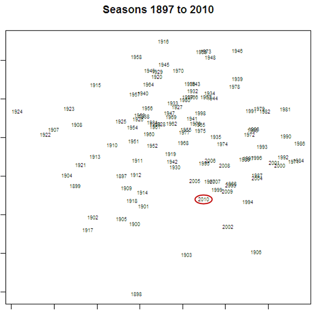
The proportion of games of each type in a season can be thought of as a signature of that season. being numeric, they provide a ready basis on which to measure how much one season is more or less like another. In fact, using a technique called principal components analysis we can use each season's signature to plot that season in two-dimensional space (using the first two principal components).

Here's what we get:

2010 - Home and Away Season Similarity.png

I've circled the point labelled "2010", which represents the current season. The further away is the label for another season, the more different is that season's profile of game types in comparison to 2010's profile.

So, for example, 2009, 1999 and 2005 are all seasons that were quite similar to 2010, and 1924, 1916 and 1958 are all seasons that were quite different. The table below provides the profile for each of the seasons just listed; you can judge the similarity for yourself.

2010 - Seasons Similar to 2010.png

Signatures can also be created for eras and these signatures used to represent the profile of game results from each era. If you do this using the eras as I've defined them, you get the chart shown below.

One way to interpret this chart is that there have been 3 super-eras in VFL/AFL history, the first spanning the seasons from 1897 to 1920, the second from 1921-1980, and the third from 1981-2010. In this latter era we seem to be returning to the profiles of the earliest eras, which was a time when 50% or more of all results were Coast-to-Coast game types.

2010 - Home and Away Era Similarity.png

Season 2010: An Assessment of Competitiveness

For many, the allure of sport lies in its uncertainty. It's this instinct, surely, that motivated the creation of the annual player drafts and salary caps - the desire to ensure that teams don't become unbeatable, that "either team can win on the day".

Objective measures of the competitiveness of AFL can be made at any of three levels: teams' competition wins and losses, the outcome of a game, or the in-game trading of the lead.

With just a little pondering, I came up with the following measures of competitiveness at the three levels; I'm sure there are more.

2010 - Measures of Competitiveness.png

We've looked at most - maybe all - of the Competition and Game level measures I've listed here in blogs or newsletters of previous seasons. I'll leave any revisiting of these measures for season 2010 as a topic for a future blog.

The in-game measures, though, are ones we've not explicitly explored, though I think I have commented on at least one occasion this year about the surprisingly high proportion of winning teams that have won 1st quarters and the low proportion of teams that have rallied to win after trailing at the final change.

As ever, history provides some context for my comments.

2010 - Number of Lead Changes.png

The red line in this chart records the season-by-season proportion of games in which the same team has led at every change. You can see that there's been a general rise in the proportion of such games from about 50% in the late seventies to the 61% we saw this year.

In recent history there have only been two seasons where the proportion of games led by the same team at every change has been higher: in 1995, when it was almost 64%, and in 1985 when it was a little over 62%. Before that you need to go back to 1925 to find a proportion that's higher than what we've seen in 2010.

The green, purple and blue lines track the proportion of games for which there were one, two, and the maximum possible three lead changes respectively. It's also interesting to note how the lead-change-at-every-change contest type has progressively disappeared into virtual non-existence over the last 50 seasons. This year we saw only three such contests, one of them (Fremantle v Geelong) in Round 3, and then no more until a pair of them (Fremantle v Geelong and Brisbane v Adelaide) in Round 20.

So we're getting fewer lead changes in games. When, exactly, are these lead changes not happening?

2010 - Lead Changes from One Quarter to the Next.png

Pretty much everywhere, it seems, but especially between the ends of quarters 1 and 2.

The top line shows the proportion of games in which the team leading at half time differs from the team leading at quarter time (a statistic that, as for all the others in this chart, I've averaged over the preceding 10 years to iron out the fluctuations and better show the trend). It's been generally falling since the 1960s excepting a brief period of stability through the 1990s that recent seasons have ignored, the current season in particular during which it's been just 23%.

Next, the red line, which shows the proportion of games in which the team leading at three-quarter time differs from the team leading at half time. This statistic has declined across the period roughly covering the 1980s through to 2000, since which it has stabilised at about 20%.

The navy blue line shows the proportion of games in which the winning team differs from the team leading at three-quarter time. Its trajectory is similar to that of the red line, though it doesn't show the jaunty uptick in recent seasons that the red line does.

Finally, the dotted, light-blue line, which shows the overall proportion of quarters for which the team leading at one break was different from the team leading at the previous break. Its trend has been downwards since the 1960s though the rate of decline has slowed markedly since about 1990.

All told then, if your measure of AFL competitiveness is how often the lead changes from the end of one quarter to the next, you'd have to conclude that AFL games are gradually becoming less competitive.

It'll be interesting to see how the introduction of new teams over the next few seasons affects this measure of competitiveness.

A Competition of Two Halves

In the previous blog I suggested that, based on winning percentages when facing finalists, the top 8 teams (well, actually the top 7) were of a different class to the other teams in the competition.

Current MARS Ratings provide further evidence for this schism. To put the size of the difference in an historical perspective, I thought it might be instructive to review the MARS Ratings of teams at a similar point in the season for each of the years 1999 to 2010.

(This also provides me an opportunity to showcase one of the capabilities - strip-charts - of a sparklines tool that can be downloaded for free and used with Excel.)

2010 - Spread of MARS Ratings by Year.png

In the chart, each row relates the MARS Ratings that the 16 teams had as at the end of Round 22 in a particular season. Every strip in the chart corresponds to the Rating of a single team, and the relative position of that strip is based on the team's Rating - the further to the right the strip is, the higher the Rating.

The red strip in each row corresponds to a Rating of 1,000, which is always the average team Rating.

While the strips provide a visual guide to the spread of MARS Ratings for a particular season, the data in the columns at right offer another, more quantitative view. The first column is the average Rating of the 8 highest-rated teams, the middle column the average Rating of the 8 lowest-rated teams, and the right column is the difference between the two averages. Larger values in this right column indicate bigger differences in the MARS Ratings of teams rated highest compared to those rated lowest.

(I should note that the 8 highest-rated teams will not always be the 8 finalists, but the differences in the composition of these two sets of eight team don't appear to be material enough to prevent us from talking about them as if they were interchangeable.)

What we see immediately is that the difference in the average Rating of the top and bottom teams this year is the greatest that it's been during the period I've covered. Furthermore, the difference has come about because this year's top 8 has the highest-ever average Rating and this year's bottom 8 has the lowest-ever average Rating.

The season that produced the smallest difference in average Ratings was 1999, which was the year in which 3 teams finished just one game out of the eight and another finished just two games out. That season also produced the all-time lowest rated top 8 and highest rated bottom 8.

While we're on MARS Ratings and adopting an historical perspective (and creating sparklines), here's another chart, this one mapping the ladder and MARS performances of the 16 teams as at the end of the home-and-away seasons of 1999 to 2010.

2010 - MARS and Ladder History - 1999-2010.png

One feature of this chart that's immediately obvious is the strong relationship between the trajectory of each team's MARS Rating history and its ladder fortunes, which is as it should be if the MARS Ratings mean anything at all.

Other aspects that I find interesting are the long-term decline of the Dons, the emergence of Collingwood, Geelong and St Kilda, and the precipitous rise and fall of the Eagles.

I'll finish this blog with one last chart, this one showing the MARS Ratings of the teams finishing in each of the 16 ladder positions across seasons 1999 to 2010.

2010 - MARS Ratings Spread by Ladder Position.png

As you'd expect - and as we saw in the previous chart on a team-by-team basis - lower ladder positions are generally associated with lower MARS Ratings.

But the "weather" (ie the results for any single year) is different from the "climate" (ie the overall correlation pattern). Put another way, for some teams in some years, ladder position and MARS Rating are measuring something different. Whether either, or neither, is measuring what it purports to -relative team quality - is a judgement I'll leave in the reader's hands.

The Eight We Had To Have?

This blog addresses a single topic: amongst the eight teams that won't be taking part in the weekend's festivities, are there any that can legitimately claim that they should be?

In short: I don't think so, though the Roos do have a prima facie case.

Exhibit A: a summary of the bottom 8 teams' performances against the finalists.

None of the non-finalists defeated finalists during the season even close to half the time. In fact, amongst the eight of them they mustered only 9.5 wins from 44 games during the second half of the season.

Essendon has the best overall record, 5 wins and 9 losses, but four of the five wins came in the first 10 rounds of the season, after which the Dons went 1 and 6 for the remainder.

The Dons do have some justification for feeling a little aggrieved, however, in that they faced teams from the top 8 on 14 occasions, which is twice more than any other team in the competition. But even if you swapped two or three of their tougher fixtures for more winnable encounters and if you assume that they won them all, they still fall short of the 44 points needed for a spot in the eight.

(By the way, Essendon's difficult draw was something that we noted before the season even commenced.)

Adelaide have the next best record against the finalists - which is one of the reasons their MARS Rating is above 1,000 - but a win percentage of 27% hardly screams "injustice". No other team racked up better than a 1 in 4 performance.

The generally dismal performance of the bottom 8 teams when playing teams from the top 8 hints at a fairly strong divide between the finalists and the non-finalists. This next graphic, I think, provides additional supporting evidence for this view.

Each pie depicts the win percentage that the relevant team recorded when playing teams from within the top 8 (left-hand pie) and from outside it (right-hand pie).

Scanning the left-hand pies you can see how much stronger, generally, is the performance of teams from the top 8 when playing other teams from the top 8 than is the performance of teams from outside the top 8 when playing the finalists.

The comparative performances of the two teams on either side of the finals barrier - Carlton and the Roos - is interesting. The Roos, apparently, have a better win percentage than Carlton when playing teams from within the 8 and when playing teams from outside the 8. How can that be when you consider that both teams finished with 11 wins and 11 losses this season and so must have the same overall win percentage?

It all comes down to ... the unbalanced draw (there's a topic I've not railed about for a while). Carlton have a 20% record against top 8 teams and a 75% record against bottom 8 teams, but met top 8 teams on only 10 occasions and bottom 8 teams on 12 occasions. The Roos, on the other hand, have a 25% record against top 8 teams and an 80% record against bottom 8 teams. But their proportions are reversed compared to the Blues'. The Roos played teams from the top 8 on 12 occasions and teams from the bottom 8 on only 10 occasions, and this difference in mix was just enough to have them finish on 11 wins, the same as the Blues.

(The relative difficulty of the Roos' draw when compared to the Blues' was also noted in that same blog.)

To borrow a topical term, does this give the Roos a "mandate" for a spot in the eight? Well they certainly have a stronger case for inclusion than the Blues' - particularly when you add in the fact that the Roos defeated the Blues 97-68 on the only occasion that they met this season -but does any team deserve a place in the 8 whose record against the finalists is no better than that of the teams that finished 13th and 14th?

I'd argue that neither Carlton nor the Roos truly deserve a spot in the eight - and neither does any other of the non-finalists. Leave them both out, I say, and give Sydney a bye in the 1st week of the finals.

(I did register some disappointment when the Roos missed a spot in the 8. For some time I've hoped that they would face Sydney in an important game one day and that they would pip the Swans in a tight contest on the basis of some clever tactical subterfuge. Next day, I imagined, an alert sub-editor would seize the opportunity and pen the following unforgettable headline: "Roos rues Roos' ruse". But, alas, that can never happen now.)

Finalist v Finalist: Who Has the Best Record in 2010?

Twenty-three weeks of footy is over and the AFL's binary division has begun, with the sixteen teams now cleaved in two.

Let's take a look at how the finalists have performed when they've met one of their own.

Collingwood

They finished atop the ladder after overcoming what turned out to be the toughest draw amongst the finalists. In 12 of the home-and-away season's 22 rounds the Pies met another team from the top 8 - that's only two fewer than a maximum possible 14, and at least one more than every other team.

The Pies won 75% of these encounters and outscored their competitors by 28% in them, winning each contest by an average of almost four goals. As well, they recorded the best 1st, 2nd and 3rd quarter performances of all the finalists, blemishing their record only with a relatively poor 5 and 7 performance in final terms, ranking them 4th.

One other concern for Pies fans - aside from their alleged Collywobbledom - will be their scoring shot conversion rate (aka their ability to kick straight). At just 48.9%, their conversion rate is the poorest amongst the eight finalists. They've got away with this wastefulness by generating so many more scoring shots than their opponents - 30.2 per game, which is almost 3 shots per game more than Geelong, who are next best, and is at least 5 shots per game better than any other finalist.

Geelong

The Cats played other finalists 11 times this season, winning seven and losing four. Four of these contests took place in Rounds 18 to 21, during which Geelong went 3 and 1, which surely must have provided some level of confidence going into the season's main games.

In these 11 contests the Cats outscored their opponents by almost 25%, scoring about 20 points more than their rivals in each game. They've generated over 27 scoring shots per game but converted these at a relatively poor 54.5%, and conceded 24.5 scoring shots per game, which they've allowed their opponents to convert into goals at an impressively miserly rate of just 46.7% - the lowest amongst the finalists.

They've been strong across every quarter, though they have struggled on some occasions to generate points in the first term where, despite winning 64% of these quarters, overall they've actually been narrowly outscored by their opponents.

St Kilda

If you're a Saints fan, you've reasons to worry.

They met fellow-finalists on only nine occasions this season - the fewest of any finalist - and met none in the last five rounds. Perhaps more worrying is the fact that they've recorded a loss and a draw in their last two encounters with top 8 teams, meaning that they've not beaten a finalist since Round 14. 

Still, their early season form against the main contenders was strong - so strong in fact that, overall, they have the second best win-loss record of all eight teams in the finals.

I've noted before how much trouble the Saints have had scoring points and this affliction is very much in evidence in their performances against the other finalists. In these games the Saints have managed to score only 76 points per game, comfortably the worst performance of any of the teams. Their scoring deficiency has two causes: few scoring shots per game (21.0, also the worst amongst the finalists) and poor conversion (52.4%, better only than the Pies).

What's kept them in the hunt has been their defence. They've allowed just 21.3 scoring shots per game, which ranks them 1st on this statistic, and permitted their opponents to convert these scant opportunities at a rate of just 52.6%, which ranks them 3rd.

They've been slow starters in games against finalists, winning only one-third of 1st and 2nd terms while being outscored by 10-15% in each. Their second halves have been better, though not spectacular, which sees them rank 4th and 5th on quarter 3 and quarter 4 performances respectively.

Western Bulldogs

As you know, MARS Ratings suggest that the Dogs are being significantly underrated, but there's not a lot to support this assessment in a review of the Dogs' performance against other teams in the eight.

They've played 10 matches against other finalists, winning just six, and they've scored and conceded about 93 points per game in each. Most recently, they met finalists in Rounds 20 and 21, losing on both occasions, which is part of what's contributed to their significant rerating by the bookies.

Their statistics for scoring shot production, scoring shot conversion, and scoring shot concession all rank them mid-pack. What's hurt them has been the rate at which opponents have converted scoring shot opportunities: 58.5% of the time, easily the highest amongst their peers.

Similarly, their quarter-by-quarter performance is marred only by a single statistic - their final term results. They've won only 40% of final terms against finalists and been outscored by around 15%.

Sydney

Swans fans will take heart from their recent performances against the teams they're likely to meet in coming weeks.

Across Round 16 to 21 they met fellow-finalists on five occasions, winning four of these encounters and losing only one. Before this purple patch of form, the Swans had gone 0 and 6 against finalists, so their combined season record is an unremarkable 4 wins and 7 losses.

In these 11 encounters the Swans have been outscored by about 10%, scoring 85 points per game and conceding 94. On all the scoring related metrics - shots scored and conceded per game, own and opponent scoring shot conversion - they're ranked either 5th or 6th.

Their quarter-by-quarter performance is curious. In win-loss terms they've the worst 1st quarter performance of any of the teams remaining, having won 2 and lost 9 1st terms. However, they've narrowly outscored their opponents in these quarters.

In 3rd quarters their performance has been worse. They've won only a single 3rd term, drawn another, and lost the remaining nine, scoring 194 points and conceding 324 in doing so.

But they have the best final term record of all the finalists: won 8, lost 3, percentage 123. I'm not sure, though, that you want to make a habit of relying on barnstorming finishes in finals.

Fremantle

Freo have, I'd say, just done enough to get into the eight. Their MARS Rating is only 995.5, which makes them only the 3rd team in the last seven seasons to make the finals with a sub-1000 MARS Rating and the lowest-rated team to finish 6th on the competition ladder across all 12 seasons for which I've calculated MARS Ratings.

They've played 10 games against fellow-finalists, winning only four and being outscored by an average of about 22 points per game. Four of these contests came in the last six weeks of the season; they went 1 and 3 in these matches.

Fremantle has conceded more scoring shots per game (28.5) than any other team in the eight, though they've reduced the consequences of this profligacy somewhat by allowing these opportunities to be converted only 56.5% of the time - the third-best performance amongst all the finalists.

Their quarter-by-quarter performances have been fairly consistent and generally below average, brightened only a little by their 50% win-loss record and 104 percentage performance in 2nd terms.

Hawthorn

A glance at their performance record against fellow-finalists suggests that their 7th placed finish might be a tad misleading. Their 50% win-loss record is the 4th-best amongst the finalists and is underpinned by a 104 percentage in games against other teams in the eight.

They've performed well on two aspects of scoring performance: scoring shot production, where their 25.0 scoring shots per game ranks them 3rd, and opponent conversion rate, where their 49.1% rate ranks them 2nd.

But they've stumbled on the other two scoring dimensions. Their own conversion rate of 53.5% is only good enough for 5th spot, and their concession of 25.5 scoring shots per game ranks them 6th on this metric.

The Hawks have consistently started well in games involving other finalists. They boast a 7 and 4 record in 1st terms, which is 2nd best amongst all the finalists, and they've outscored their opponents 248-221 in these quarters. They've not generally been able to sustain this level of performance, however, and have won only about 40% of 2nd, 3rd and final terms, recording percentages of around 100 - a little less in the case of final terms - in doing so.

Carlton

Carlton have done reasonably well this year - whenever they've been playing a team from outside the eight.

Their record against top 8 teams is 2 and 8, with both wins recorded in the space of three weeks way back in Rounds 5 and 7. Since then the Blues have gone 0 and 7 against the finalists including back-to-back losses against fellow-finalists in Rounds 21 and 22.

During their 10 clashes with finalists, the Blues have been outscored by almost 4 goals per game as they've struggled both to create scoring shot opportunities (21.6 per game, ranked 7th) and prevent them for their opponents (27.9 per game, also ranked 7th). They have though been markedly respectful of the chances they've had, converting them at a rate of 56.9%, the highest rate amongst all the finalists. But they've also allowed their opponents to convert at a relatively high rate of 55.2%, ranking them 6th on this metric.

Quarters 1 through 3 have, on average, been best forgotten by Blues supporters. The win-loss percentages for the Blues for these quarters have been 30%, 20% and 40% respectively, and the scoring percentages of 75, 58 and 88 would read better were they cricketing rather than football related results.

The Blues have, though, generally finished well against their peers, winning 60% of final terms to rank 3rd on performances in this term, albeit by only scoring 3% more points than they've conceded.

Still, if you win a Grand Final by securing only 50.7% of the points ...

Why Sydney Won't Finish Fourth


As the ladder now stands, Sydney trail the Dogs by 4 competition points but they have a significantly inferior percentage. The Dogs have scored 2,067 points and conceded 1,656, giving them a percentage of 124.8, while Sydney have scored 1,911 points and conceded 1,795, giving them a percentage of 106.5, some 18.3 percentage points lower.


If Sydney were to win next week against the Lions, and the Dogs were to roll over and play dead against the Dons, then fourth place would be awarded to the team with the better percentage. Barring something apocalyptic, that'll be the Dogs.

Here's why. A few blogs back I noted that you could calculate the change in a team's percentage resulting from the outcome of a single game by using the following expression:

(1) Change in Percentage = (%S - %C)/(1 + %C) * Old Percentage

where %S = the points scored by the team in the current game as a percentage of the points it had already scored in the season,

and %C = the points conceded by the team in the current game as a percentage of the points it had already conceded in the season.

Now at this stage of the season, a big win or loss for a team will be one where the difference between %S and %C is in the 6-8% range, bearing in mind that a single game now represents about 1/20th or 5% of the season, so a 'typical' %S or %C would be about 5%. Scoring twice as many points as 'expected' then would give a %S of 10%, and conceding half as many as 'expected' would give a %C of 2.5%, a difference of 7.5%.

Okay, so consider a big loss for the Dogs, say 30-150. That gives a (%S - %C) of around -7.5%, which (1) tells us means the Dogs' percentage will change by about -7.5%/1.1 x 1.25, which is 8.5 percentage points. That drops the Dogs' percentage to about 116.

Next consider a big win for the Swans, again say 150-30. For them, that's a (%S - %C) of 6%, which gives them a percentage boost of 6%/1.02 x 1.06, which is about 6 percentage points. That lifts their percentage to about 112.5, still 3.5 percentage points short of the Dogs'.

To completely close the gap, Sydney needs its percentage change plus the Dogs' to exceed 18.3 percentage points, the percentage chasm it currently faces. Using this fact and the expression in (1) above for both teams, you can derive the fact that, to lift its percentage above the Dogs', Sydney needs the following to be true:

Sydney's (%S - %C) > 18.3% - 1.15 times the Dogs' (%S - %C)

Now my worst case 30-150 loss for the Dogs gives them a (%S - %C) of -7.6%. That means Sydney needs its (%S - %C) to be about 9.5%. So even if Sydney were to concede no points at all to the Lions - making %C equal to 0 - they'd need to score about 180 points to achieve this.

More generally still, Sydney need the sum of their victory margin and the Dogs' margin of defeat to be around 300 points if they're to grab fourth.

Sydney won't finish fourth.

Letting the Computer Do (Most of) the Work

Around this time of year it's traditional to work through the remaining matches for each team and attempt to codify what each needs to do in order to secure a particular finish - minor premiership, top 4, top 8 or Spoon.

This year, rather than work through all the combinations manually, I've decided to be lazy - purely for instructional purposes, I should add - and enlist the help of rule induction, a mathematical technique for deducing from a dataset statements in the form If A and B then C that describe key variables in that data.

So, for example, if you were to apply the technique to help describe the use of heating and cooling appliances by a household over the course of a few years you might collect information several times each day about who was home, what the outside temperature was, what day of the week and time of day it was, and whether or not a heating or a cooling appliance was turned on.

Using a rule induction algorithm, you'd be able to come up with statements such as this one: 

  • If Number of People Home is greater than 0 AND Outside Temperature is less than 15 degrees AND Time of Day is between 5:30pm and 11:30pm AND Day of Week is not Saturday or Sunday then Heating = ON (Probability 92%)

For this blog I provided a rule induction algorithm (the JRip Weka algorithm running in R, if you're curious) with the outputs from 10,000 of the simulations I used in my earlier blog, which included for each simulation:

  • The results of each of the remaining 16 games
  • The final ladder positions of each team if these were the actual results of each game

To simplify matters a little, and recognising that the main interest is not in exact ladder position finishes, I summarised each team's finishing position as either "1st","2nd to 4th","5th to 8th","9th to 15th", or "16th".

The goal was that the rule induction algorithm would output rules of the form:

  • If X beats Y AND X beats Z AND ... then X finishes 5th to 8th

Rule induction worked remarkably well. Here are a few real examples of the rules that the algorithm offered up for Collingwood's fate:

  • Rule 1: (Collingwood..v..Adelaide <= 0) and (Hawthorn..v..Collingwood >= 0) and (Carlton..v..Geelong <= 0) => Collingwood = 2nd to 4th (168.0/2.0)
  • Rule 2: => Collingwood =1st (9832.0/0.0)

Rule 1 can be interpreted as follows: 

  • If Collingwood loses to or draws with Adelaide (ie the margin in that game, couched in terms of Collingwood is less than or equal to zero) AND Collingwood loses to or draws with Hawthorn AND Geelong beats or draws with Carlton then Collingwood finish 2nd to 4th.

What's implicit here is that Geelong also beats West Coast but since, in the simulations, this always occurred when the other conditions in the rule were met, the algorithm didn't realise that this was an additional required condition.

As well, Collingwood can't be allowed to draw both its games otherwise Geelong can't overhaul them. Again, this situation didn't occur in the simulations I provided the algorithm, and not even the smartest algorithm can intuit instances that it's never seen.

I could probably have fixed both of these shortcomings by providing the algorithm with more than 10,000 simulations, though I'd pay a price in terms of computation time. Note though the (168.0 / 2.0) annotation at the end of this rule. That tells you that the rule could be applied to 168 of the simulations, but that it was wrong for 2 of them. Maybe the two simulations for which the rule applied but was incorrect included a Geelong loss to the Eagles or two draws for Collingwood.

Rule creation algorithms include what's called a "stopping rule" to prevent them from creating a unique rule for every simulation result, which might make the rules highly accurate but also makes them completely impractical.

Rule 2 is the "otherwise" rule and is interpreted as the predicted outcome if none of the earlier rules' full set of conditions are met. For Collingwood, "otherwise" is that they finish 1st.

The rules provided for other teams were generally quite similar, although they became more complex for teams when percentages were required to determine crucial ladder positions. Here, for example, are a few of the rules where the algorithm is attempting to model Hawthorn getting bumped into 9th by Melbourne: 

  • (Hawthorn..v..Fremantle <= -7) and (Port.Adelaide..v..Melbourne = -14) and (Melbourne..v..Kangaroos >= 20) and (Hawthorn..v..Collingwood = -39) and (Melbourne..v..Kangaroos Hawthorn = 9th to 15th (54.0/2.0)
     
  • (Hawthorn..v..Fremantle <= -4) and (Port.Adelaide..v..Melbourne = -7) and (Melbourne..v..Kangaroos = 11) and (Hawthorn..v..Collingwood = -59) and (Port.Adelaide..v..Melbourne = -32) = Hawthorn = 9th to 15th (41.0/3.0)

Granted that's a mite convoluted, but nothing that a human can't recognise fairly quickly, which nicely illustrates my experience with this type of algorithm: their outputs almost always contain some useful insights but the extraction of this insight requires human interpretation.

What follows then are the rules that man and machine have crafted for each team (note that I've chosen to ignore the possibility of draws to reduce complexity)

Collingwood 

  • Finish 2nd to 4th if Collingwood lose to Adelaide and Hawthorn AND Geelong beat Carlton and West Coast
  • Otherwise finish 1st

Geelong

  • Finish 1st if Collingwood lose to Adelaide and Hawthorn AND Geelong beat Carlton and West Coast
  • Otherwise finish 2nd to 4th

 St Kilda

  • Finish 2nd to 4th

 Western Bulldogs

  • Finish 5th to 8th if Dogs lose to Essendon and to Sydney AND Fremantle beat Hawthorn and Carlton
  • Otherwise finish 2nd to 4th

 Fremantle

  • Finish 2nd to 4th if Dogs lose to Essendon and to Sydney AND Fremantle beat Hawthorn and Carlton
  • Otherwise finish 5th to 8th 

Carlton and Sydney

  • Finish 5th to 8th

Hawthorn 

  • Finish 9th to 15th if Hawthorn lose to Fremantle and Collingwood AND Roos beat West Coast and Melbourne
  • Also Finish 9th to 15th if Hawthorn lose to Fremantle and Collingwood AND Melbourne beat Port and Roos sufficient to raise Melbourne's percentage above Hawthorn's
  • Otherwise finish 5th to 8th

Kangaroos

  • Finish 5th to 8th if Hawthorn lose to Fremantle and Collingwood AND Roos beat West Coast and Melbourne
  • Otherwise finish 9th to 15th 

Melbourne 

  • Finish 5th to 8th if Hawthorn lose to Fremantle and Collingwood AND Melbourne beat Port and Roos sufficient to raise Melbourne's percentage above Hawthorn's
  • Otherwise finish 9th to 15th 

Adelaide, Port Adelaide and Essendon

  • Finish 9th to 15th 

Brisbane Lions 

  • Finish 16th if Lions lose to Essendon and Sydney AND West Coast beat Geelong and Roos sufficient to lift West Coast's percentage above the Lions' AND Richmond beat St Kilda or Port (or both)
  • Otherwise finish 9th to 15th 

Richmond 

  • Finish 16th if West Coast beat Geelong and Roos AND Richmond lose to St Kilda and Port Otherwise finish 9th to 15th 

West Coast 

  • Finish 9th to 15th if West Coast beat Geelong and Roos AND Richmond lose to St Kilda and Port Finish 9th to 15th if West Coast beat Geelong and Roos AND Lions lose to Essendon and Sydney sufficient to lift West Coast's percentage above the Lions'
  • Otherwise finish 16th

As a final comment I'll note that the rules don't allow for the possibility of Sydney or Carlton slipping into 4th. Although this is mathematically possible, it's so unlikely that it didn't occur in the simulations provided to the algorithm. (Actually, it didn't occur in any of the 100,000 simulations from which the 10,000 were chosen either.)

A quick bit of probability shows why.

Consider what's needed for Sydney to finish fourth.
1. The Dogs lose to Essendon and Sydney
2. Sydney also beat the Lions
3. Fremantle don't win both their games

Furthermore, combined, Sydney and the Dogs' results have to close the percentage gap between the two teams, which currently stands at over 25 percentage points.

But the 15% and 60% figures just relate to the probability of the required result, not the probability that the wins and losses will be big enough to lift Sydney's percentage above the Dogs'. If Sydney were to trounce the Lions by 100 points and Essendon were to do likewise to the Dogs, then Sydney would still need to beat the Dogs by about 91 points to achieve such a lift.

So let's revise the probability of 1 down to 0.01% (which is probably generous) and the probability of 2 down to 5% (which is also generous). Then the overall probability is 0.01% x 5% x 80%, or about 1 in 250,000. Not gonna happen.

(For similar reasons there are also no rules for Fremantle dropping a game but still grabbing 4th from the Dogs on the basis of a superior percentage.)

Sometimes the Hare Wins

Leading early has never been as predictive of the final outcome as it has been this season.

Consider the statistics. In the 150 games that have produced a clear winner, that winner has led 75% of the time at the 1st change, 76% of the time at the main break, and a startling 89% of the time at the final change. Put another way, only 16 teams have trailed at the final change - by any amount - and gone on to win.

If we exclude slender leads, come-from-behind victories all but vanish. Only 8 teams with a lead of 2 goals or more at quarter time have surrendered that lead, and only 2 teams with a lead of 3 goals or more have done similarly from that point. A lead of 2 goals or more at the main break has been insufficient on only 9 occasions, and a lead of 3 goals or more on only 5 occasions.

No team - not one - has surrendered a three-quarter time lead of 3 goals or more this season, and only 6 teams have lost after leading at the final change by just 1 goal or more.

In an historical context, these statistics are all anomalous, as are the statistics relating to the quarters won by winning teams.

Usually, the teams that win have differentially asserted their dominance in the 3rd or the 4th quarter of games. Whilst winning the 1st or 2nd quarters has always been of some importance, failing to do so has, in years past, not been a significant impediment to victory. This year, however, winning teams have dominated 1st quarters most of all - teams that have taken the competition points have won 75% of 1st terms, but only 67% of 2nd terms, 69% of 3rd terms, and 72% of 4th terms.

Lead early, lead often.

Playing the Percentages


It seems very likely that this season, some ladder positions will be decided on percentage, so I thought it might be helpful to give you an heuristic for estimating the effect of a game result on a team's percentage.

A little maths produces the following exact result for the change in a team's percentage:

(1) New Percentage = Old Percentage + (%S - %C)/(1 + %C) * Old Percentage

where

%S = the points scored by the team in the game in question as a percentage of the points it has scored all season, excluding this game, and

%C = the points conceded by the team in the game in question as a percentage of the points it has conceded all season, excluding this game.

(In passing, I'll note that this equation makes it obvious that the only way for a team to increase its percentage on the basis of a single result is for %S to be greater than %C or, equivalently, for %S/%C to be greater than 1. Put another way, the team's percentage in the most current game needs to exceed its pre-game percentage.

This equation also puts a practical cap on the extent to which a team's percentage can alter based on the result of any one game at this stage of the season. For a team with a high percentage the term (%S - %C) will rarely exceed 5%, so a team with, for example, an existing percentage of 140 will find it hard to move that percentage by more than about 7 percentage points. Alternatively, a team with an existing percentage of just 70, which might at the extremes produce a (%S - %C) of 7%, will find it hard to move its percentage by more than about 5 percentage points in any one game.)

As an example of the use of equation (1) consider Sydney, who have scored 1,701 points this season and conceded 1,638, giving them a 103.8 percentage. If we assume, since this is Round 20, that they'll rack up a score this week that's about 5% of what they've previously scored all season and that they'll concede about 4%, then the formula tells us that their percentage will change by (5% - 4%)/(104%) * 103.8 = 1 percentage point.

Now 5% x 1,701 is about 85, and 4% x 1,638 is about 66, so we've implicitly assumed an 85-66 victory by the Swans in the previous paragraph. Recalculating Sydney's percentage the long way we get (1,701+85)/(1,638+66), which gives a 104.8 percentage and is, indeed, a 1 percentage point increase.

So we know that the formula works, which is nice, but not especially helpful.

To make equation (1) more helpful, we need firstly note that at this stage of the season the points that a team concedes in a game are unlikely to be a large proportion of the points they've already conceded so far in the entire season. So the (1+C%) in equation (1) is going to be very close to 1. That allows us to rewrite the equation as:

(2) Change in Percentage = (%S - %C) * Old Percentage

Now this equation makes it a little easier to play some what-if games.

For example we can ask what it would take for Sydney, who are currently equal with Carlton on competition points, to lift their percentage above Carlton's this weekend. Sydney's percentage stands now at 103.8 and Carlton's at 107.0, so Sydney needs a 3.2 percentage point lift.

Using a rearranged version of Equation (2) we know that achieving a lift of 3.2 percentage points from a current percentage of 103.8 requires that (%S - %C) be greater than 3.2/103.8, or about 3%. Now, if we assume that Sydney will concede points roughly equal to its season-long average then %C will be 1/19 or a bit over 5%.

So, to get the necessary lift in percentage, Sydney will need %S to be a bit over 5% + 3%, or 8%. To turn that into an actual score we take 8% x 1,701 (the number of points Sydney has scored in the season so far), which gives us a score of about 136. That's how many points Sydney will need to score to lift its percentage to around 107, assuming that its opponent this week (Fremantle) scores 5% x 1,638, which is approximately 82 points.

Within reasonable limits you can generalise this and say that Sydney needs to beat Fremantle by 54 points or more to lift its percentage to 107, regardless of the number of points Freo score. In reality, as Fremantle's score increase - and so %C rises - the margin of victory required by Sydney also rises, but only by a few points. A 60-point margin of victory will be enough to lift Sydney's percentage over Carlton's even in the unlikely event that the score in the Sydney v Freo game is as high as 170-110.

Okay, let's do one more what-if, this one a bit more complex.

What would it take for Melbourne to grab 8th spot this weekend? Well the Roos and Hawthorn would need to lose and the combined effect of Hawthorn's loss and Melbourne's win would need to drag Melbourne's percentage above Hawthorn's. Conveniently for us, Hawthorn and Melbourne meet this weekend. Even more conveniently, their respective points for and points against are all quite close: Hawthorn's scored 1,692 points and conceded 1,635; Melbourne's scored 1,599 and conceded 1,647.

The beauty of this fact is that, for both teams, in equation (2) Old Percentage is approximately 1 and, for any score, Hawthorn's %S will be approximately Melbourne's %C and vice versa. This means that any increase in percentage achieved by either team will be mirrored by an equivalent decrease in the percentage of the other.

All Melbourne needs do then to lift its percentage above Hawthorn's is to lift its percentage by one half the current difference. Melbourne's percentage stands at 97.1 and Hawthorn's at 103.5, so the difference is 6.4 and the target for Melbourne is an increase of 3.2 percentage points.

Melbourne then needs (%S-%C) to be a bit bigger than 3%. Since the divisors for both %S and %C are about the same we can re-express this by saying that Melbourne's margin of victory needs to be around 3% of the points it's conceded so far this season, which is 3% of 1,647 or around 50 points. Let's add on a few points to account for the fact that we need the margin to be a little over 3% and call the required margin 53 points.

So how good is our approximation? Well if Melbourne wins 123-70, Hawthorn's new percentage would be (1,692+70)/(1,635+123) = 1.002, and Melbourne's would be (1,599+123)/(1,647+70) = 1.003. Score 1 for the approximation. If, instead, it were a high-scoring game and Melbourne won 163-110, then Hawthorn's new percentage would be (1,692+110)/(1,635+163) = 1.002, and Melbourne's would be (1,599+163)/(1,647+100) = 1.003. So that works too.

In summary, a victory by the Dees over the Hawks by around 9-goals or more would, assuming the Roos lose to West Coast, propel Melbourne into the eight - not a confluence of events I'd be willing to wager large sums on, but a mathematical possibility nonetheless.

Line Betting : A Codicil

While contemplating the result from an earlier blog, which was that home teams had higher handicap-adjusted margins and won at a rate significantly higher than 50% on line betting - virtually regardless of the start they were giving or receiving - I wondered if the source of this anomaly might be that the bookie gives home teams a slightly better deal in setting line margins.
Read More

A Line Betting Enigma

The TAB Sportsbet bookmaker is, as you know, a man to be revered and feared in equal measure. Historically, his head-to-head prices have been so exquisitely well-calibrated that I instinctively compare any model I construct with the forecasts he produces. To show that a model historically outperforms leads me to scuttle off to determine what error I've made in constructing the model, what piece of information I've used that, in truth, was only available with the benefit of hindsight.
Read More