Another Day, Another Model

In the previous blog I developed models for predicting victory margins and found that the selection of a 'best' model depended on the criterion used to measure performance.

This blog I'll review the models that we developed and then describe how I created another model, this one designed to predict line betting winners.

The Low Average Margin Predictor

The model that produced the lowest mean absolute prediction error MAPE was constructed by combining the predictions of two other models. One of the constituent models - which I collectively called floating window models - looked only at the victory margins and bookie's home team prices for the last 22 rounds, and the other constituent model looked at the same data but only for the most recent 35 rounds.

On their own neither of these two models produce especially small MAPEs, but optimally combined they produce an overall model with a 28.999 MAPE across seasons 2008 and 2009 (I know that the three decimal places is far more precision than is warranted, but any rounding's going to nudge it up to 29 which just doesn't have the same ability to impress. I consider it my nod to the retailing industry, which persists in believing that price proximity is not perceived linearly and so, for example, that a computer priced at $999 will be thought meaningfully cheaper than one priced at $1,000).

Those optimal weightings were created in the overall model by calculating the linear combination of the underlying models that would have performed best over the most recent 26 weeks of the competition, and then using those weights for the current week's predictions. These weights will change from week to week as one model or the other tends to perform better at predicting victory margins; that is what gives this model its predictive chops.

This low MAPE model henceforth I shall call the Low Average Margin Predictor (or LAMP, for brevity).

The Half Amazing Margin Predictor

Another model we considered produced margin predictions with a very low median absolute prediction error. It was similar to the LAMP but used four rather than two underlying models: the 19-, 36-, 39- and 52-round floating window models.

It boasted a 22.54 point median absolute prediction error over seasons 2008 and 2009, and its predictions have been within 4 goals of the actual victory margin in a tick over 52% of games. What destroys its mean absolute prediction error is its tendency to produce victory margin predictions that are about as close to the actual result as calcium carbonate is to coagulated milk curd. About once every two-and-a-half rounds one of its predictions will prove to be 12 goals or more distant from the actual game result.

Still, its median absolute prediction error is truly remarkable, which in essence means that its predictions are amazing about half the time, so I shall name it the Half Amazing Margin Predictor (or HAMP, for brevity).

In their own highly specialised ways, LAMP and HAMP are impressive but, like left-handed chess players, their particular specialities don't appear to provide them with any exploitable advantage. To be fair, TAB Sportsbet does field markets on victory margins and it might eventually prove that LAMP or HAMP can be used to make money on these markets, but I don't have the historical data to test this now. I do, however, have line market data that enables me to assess LAMP's and HAMP's ability to make money on this market, and they exhibit no such ability. Being good at predicting margins is different from being good at predicting handicap-adjusted margins.

Nonetheless, I'll be publishing LAMP's and HAMP's margin predictions this season.

HELP, I Need Another Model

Well if we want a model that predicts line market winners we really should build a dedicated model for this, and that's what I'll describe next.

The type of model that we'll build is called a binary logit. These can be used to fit a model to any phenomenon that is binary - that is, two-valued - in nature. You could, for example, fit one to model the characteristics of people who do or don't respond to a marketing campaign. In that case, the binary variable is campaign response. You could also, as I'll do here, fit a binary logit to model the relationship between home team price and whether or not the home team wins on line betting.

Fitting and interpreting such models is a bit more complicated than fitting and interpreting models fitted using the ordinary least squares method, which we covered in the previous blog. For this reason I'll not go into the details of the modelling here. Conceptually though all we're doing is fitting an equation that relates the Home team's head-to-head price with its probability of winning on line betting.

For this modelling exercise I have again created 47 floating window models of the sort I've just described, one model that uses price and line betting result data only the last 6 rounds, another that use the same data for the last 7 rounds, and so on up to one that uses data from the last 52 rounds.

Then, as I did in creating HAMP and LAMP, I looked for the combination of floating window models that best predicts winning line bet teams.

The overall model I found to perform best combines 24 of the 47 floating window models - I'll spare you the Lotto-like list of those models' numbers here. In 2008 this model predicted the line betting winner 57% of the time and in 2009 it predicted 64% of such winners. Combined, that gives it a 61% average across the two seasons. I'll call this model the Highly Evolved Line Predictor (or HELP), the 'highly evolved' part of the name in recognition of the fact that it was selected because of its fitness in predicting line betting winners in the environment that prevailed across the 2008 and 2009 seasons.

Whether HELP will thrive in the new environment of the 2010 season will be interesting to watch, as indeed will be the performance of LAMP and HAMP.

In my previous post I drew the distinction between fitting a model and using it to predict the future and explained that a model can be a good fit to existing data but turn out to be a poor predictor. In that context I mentioned the common statistical practice of fitting a model to one set of data and then measuring its predictive ability on a different set.

HAMP, LAMP and HELP are somewhat odd models in this respect. Certainly, when I've used them to predict they're predicting for games that weren't used in the creation of any of their underlying floating window models. So that's a tick.

They are, however, fitted models in that I generated a large number of potential LAMPs, HAMPs and HELPs, each using a different set of the available floating window models, and then selected those models which best predicted the results of the 2008 and 2009 seasons. Accordingly, it could well be that the superior performance of each of these models can be put down to chance, in which case we'll find that their performances in 2010 will drop to far less impressive levels.

We won't know whether or not we're witnessing such a decline until some way into the coming season but in the meantime we can ponder the basis on which we might justify asserting that the models are not mere chimera.

Recall that each of the floating window models use as predictive variables nothing more than the price of the Home team. The convoluted process of combining different floating window models with time-varying weights for each means that, in essence, the predictions of HAMP, LAMP and HELP are all just sophisticated transformations of one number: the Home team price for the relevant game.

So, for HAMP, LAMP and HELP to be considered anything other than statistical flukes it needs to be the case that:

  1. the TAB Sportsbet bookie's Home team prices are reliable indicators of Home teams' victory margins and line betting success
  2. the association between Home team prices and victory margins, and between Home team prices and line betting outcomes varies in a consistent manner over time
  3. HAMP, LAMP and HELP are constructed in such a way as to effectively model these time-varying relationships

On balance I'd have to say that these conditions are unlikely to be met. Absent the experience gained from running these models live during a fresh season then, there's no way I'd be risking money on any of these models.

Many of the algorithms that support MAFL Funds have been developed in much the same way as I've described in this and the previous blog, though each of them is based on more than a single predictive variable and most of them have been shown to be profitable in testing using previous seasons' data and in real-world wagering.

Regardless, a few seasons of profitability doesn't rule out the possibility that any or all of the MAFL Fund algorithms haven't just been extremely lucky.

That's why I'm not retired ...

There Must Be 50 Ways to Build a Model (Reprise)

Okay, this posting is going to be a lot longer and a little more technical than the average MAFL blog (and it's not as if the standard fare around here could be fairly characterised as short and simple).

Anyway, over the years of MAFL, people have asked me about the process of building a statistical model in sufficient number and with such apparent interest that I felt it was time to write a blog about it.

Step one in building a model is, as in life, finding a purpose and the purpose of the model I'll be building for this blog is to predict AFL victory margins, surely about as noble a purpose as a model can aspire to. Step two is deciding on the data that will be used to build that model, a decision heavily influenced by expedience; often it's more a case of 'what have I already got that might be predictive?' rather than 'what will I spend the next 4 weeks of my life trying to source because I've an inkling it might help?'.

Expediently enough, the model I'll be building here will use a single input variable: the TAB Sportsbet price of the home team, generally at noon on Wednesday before the game. I have this data going back to 1999, but I've personally recorded prices only since 2006. The remainder of the data I sourced from a website built to demonstrate the efficacy of the site-owner's subscription-based punting service, which makes me trust this data about as much as I trust on-site testimonials from 'genuine' customers. We'll just be using the data for the seasons 2006 to 2009.

Fitting the Simplest Model

The first statistical model I'll fit to the data is what's called an ordinary least-squares regression - surely a name to cripple the self-esteem of even the most robust modelling technique - and is of the form Predicted Margin = a + (b / Home Team Price).

The ordinary least-squares method chooses a and b to minimise the sum of the (squared) differences between the actual victory margin and that which would be predicted using it and, in this sense, 'fits' the data best of all the possible choices of a and b that we could make.

We've seen the result of fitting this model to the 2006-2009 data in an earlier blog where we saw that it was:

Predicted Margin = -49.17 + 96.31 / Home Team Price

This model fits the data for seasons 2006 to 2009 quite well. The most common measure of how well a model of this type fits is what's called the R-squared and, for this model, it's 0.236, meaning that the model explains a little less than one-quarter of the variability in margins across games.

But this is a difficult measure to which to attach any intuitive meaning. Better perhaps is to know that, on average, the predictions of this model are wrong by 29.3 points per game and that, for one-half of the games it is within 24.1 points of the actual result, and for 27% of the games it is within 12 points.

These results are all very promising but it would be a rookie mistake to start using this model in 2010 with the expectation that it will explain the future as well as it has explained the past. It's quite common for a statistical model to fit existing data well but to forecast as poorly as a surprised psychic ('Jeez, I didn't see that coming!').

Why? Because forecasting and fitting are two very different activities. When we build the model we deliberately make the fit as good as it can be and this can mean that the model we create doesn't faithfully represent the process that created that data. This is known in statistical circles - which, I guess, are only round on average - as 'overfitting' the data and it's one of the many things over which we obsess.

Overfitting is less likely to be a problem for the current model since it has only one variable in it and overfitting is more commonly a disease of multi-variable models, but it's something that it's always wise to check. A bit like checking that you've turned the stove off before you leave home.

Testing the Model

The biggest problem with modelling the future is that it hasn't happened yet (with apologies to whoever I stole or paraphrased that from). In modelling, however, we can create an artificial reality where, as far as our model's concerned, the future hasn't yet happened. We do this by fitting the model to just a part of the data we have, saving some for later as it were.

So, here we could fit the 2006 season's data and use the resulting model to predict the 2007 results. We could then repeat this by fitting a model to the 2007 data only and then use that model to predict the 2008 results, and then do something similar for 2009. Collectively, I'll call the models that I've fitted using this approach "Single Season" models.

Each Single Season model's forecasting ability can be calculated from the difference between the predictions it makes and the results of the games in the subsequent season. If the Single Season models overfit the data then they'll tend to fit the data well but predict the future badly.

The results of fitting and using the Single Season models are as follows:

2010 - Bookie Model Comparisons.png

The first column, for comparative purposes, shows the results for the simple model fitted to the entire data set (ie all of 2006 to 2009), and the next three columns show the results for each of the Single Season models. The final column averages the results for all the Single Season models and provides results that are the most directly comparable with those in the first column.

On balance, our fears of overfitting appear unfounded. The average and median prediction errors are very similar, although the Single Season models are a little worse at making predictions that are within 3 goals of the actual result. Still, the predictions they produce seem good enough.

What Is It Good For?

The Single Season approach looks promising. One way that it might have a practical value is if it can be used to predict the handicap winners of each game at a rate sufficient to turn a profit.

Unfortunately, it can't. In 2007 and 2008 it does slightly better than chance, predicting 51.4% of handicap winners, but in 2009 it predicts only 48.1% of winners. None of these performances is good enough to make money since, at $1.90 you need to tip at better than 52.6% to make money.

In retrospect, this is not entirely surprising. Using a bookie's own head-to-head prices to beat him on the line market would be just too outrageous.

Hmmm. What next then?

Working with Windows

Most data, in a modelling context, has a brief period of relevance that fades and, eventually, expires. In attempting to predict the result of this week's Geelong v Carlton game, for example, it's certainly relevant to know that Geelong beat St Kilda last week and that Carlton lost to Melbourne. It's also probably relevant to know that Geelong beat Carlton when they last played 11 weeks ago, but it's almost certainly irrelevant to know that Carlton beat Collingwood in 2007. Finessing this data relevance envelope by tweaking the weights of different pieces of data depending on their age is one of the black arts of modelling.

All of the models we've constructed so far in this blog have a distinctly black-and-white view of data. Every game in the data set that the model uses is treated equally regardless of whether it pertains to a game played last week, last month, or last season, and every game not in the data set is ignored.

There are a variety of ways to deal with this bipolarity, but the one I'll be using here for the moment is what I call the 'floating window' approach. Using it, a model is always constructed using the most recent X rounds of data. That model is then used to predict for just the current week then rebuilt next week for the subsequent week's action. So, for example, if we built a model with a 6-round floating window then, in looking to predict the results for Round 8 of a given season we'd use the results for Rounds 2 through 7 of that season. The next week we'd use the results for Rounds 3 through 8, and so on. For the early rounds of the season we'd reach back and use last year's results, including finals.

So, next, I've created 47 models using floating windows ranging from 6-round to 52-round. Their performance across seasons 2008 and 2009 is summarised in the following charts.

First let's look at the mean and median APEs:

2010 - Floating Window APE.png

Broadly what we see here is that, in terms of mean APE, larger floating windows are better than smaller ones, but the improvement is minimal from about an 11-round window onwards. The median APE story is quite different. There is a marked minimum with a 9-round floating window, and 8-round and 10-round floating windows also perform well.

Next let's take a look at how often the 47 models produce predictions close to the actual result:

2010 - Floating Window Accuracy.png

The top line charts the percentage of time that the relevant model produces predictions that are 3-goals or less distant from the actual result. The middle line is similarly constructed but for a 2-goal distance, and the bottom line is for a 1-goal distance.

Floating windows in the 8- to 11-round range all perform well on all three metrics, consistent with their strong performance in terms of median APE. The 16-round, 17-round and 18-round floating window models also perform well in terms of frequently producing predictions that are within 2-goals of the actual victory margin.

Next let's look at how often the 47 models produce predictions that are very wrong:

2010 - Floating Window Accuracy 36.png

In this chart, unlike the previous chart, lower is better. Here we again find that larger floating windows are better than smaller ones, but only to a point, the effect plateauing out with floating windows in the 30s

Again though to consider each model's potential punting value we can look at its handicap betting performance.

2010 - Floating Window Line.png

On this measure, only the model with an 11-round floating window seems to have any exploitable potential.

But, like Columbo, we just have one more question to ask of the data ...

Dynamic Weighted Floating Windows

(Warning: This next bit hurts my head too.)

We now have 47 floating window models offering an opinion on the likely outcomes of the games in any round. What if we pooled those opinions? But, not opinions are of equal value, so which opinions should we include and which should we ignore? What if we determined which opinions to pool based on the ability of different subsets of those 47 models to fit the results of, say, the last 26 rounds before the one we're trying to predict? And what if we updated those weights each round based on the latest results?

Okay, I've done all that (and yes it took a while to conceptualise and code, and my first version, previously published here, had an error that caused me to overstate the predictive power of one of the pooled models, but I got there eventually). Here's the APE data again now including a few extra models based on this pooling idea:

2010 - Floating Window APE with Dyn.png

(The dynamic floating window model results are labelled "Dynamic Linear I (22+35)" and "Dynamic Linear II (19+36+39+52)" The numbers in brackets are the Floating Window model forecasts that have been pooled to form the Dynamic Linear model. So, for example, the Dynamic Linear I model pools only the opinions of the Floating Window models based on a 22-round and a 35-round window. It determines how best to weight the opinions of these two Floating Window models by optimising over the past 26 rounds.

I've also shown the results for the Single Season models - they're labelled 'All of Prev Season' - and for a model that always uses all data from the start of 2006 up to but excluding the current round, labelled 'All to Current'.)

The mean APE results suggest that, for this performance metric at least, models with more data tend to perform better than models with less. The best Dynamic Linear model I could find, for all its sophistication still only managed to produce a mean APE 0.05 points per game lower than the simple model that used all the data since the start of 2006, weighting each game equally.

It is another Dynamic Linear model that shoots the lights out on the median APE results, however. The Dynamic Linear model that optimally combines the opinions of 19-, 36-, 39- and 52-round floating windows produces forecasts with a median APE of just 22.54 points per game.

The next couple of charts show that this superior performance stems from this Dynamic Linear model's all-around ability - it isn't best in terms of producing the most APEs under 7 points nor in terms of producing the fewest APEs of 36 points or more.

2010 - Floating Window Accuracy with Dyn.png
2010 - Floating Window Accuracy 36 with Dyn.png

Okay, here's the clincher. Do either of the Dynamic Linear models do much of a job predicting handicap winners?

2010 - Floating Window Line with Dyn.png

Nope. The best models for predicting handicap winners are the 11-round floating window model and the model formed by using all the data since the start of 2006. They each manage to be right just over 53% of the time - a barely exploitable edge.

The Moral So Far ...

What we've seen in these results is consistent with what I've found over the years in modelling the footy. Models tend to be highly specialised, so one that performs well in terms of, say, mean APE, won't perform well in terms of median APE.

Perhaps no surprise then that none of the models we've produced so far have been any good at predicting handicap margin winners. To build such a model we need to start out with that as the explicit modelling goal, and that's a topic for a future blog.

Losing Does Lead to Winning But Only for Home Teams (and only sometimes)

For reasons that aren't even evident to me, I decided to revisit the issue of "when losing leads to winning", which I looked at a few blogs back.

In that earlier piece no distinction was made between which team - home or away - was doing the losing or the winning. Such a distinction, it turns out, is important in uncovering evidence for the phenomenon in question.

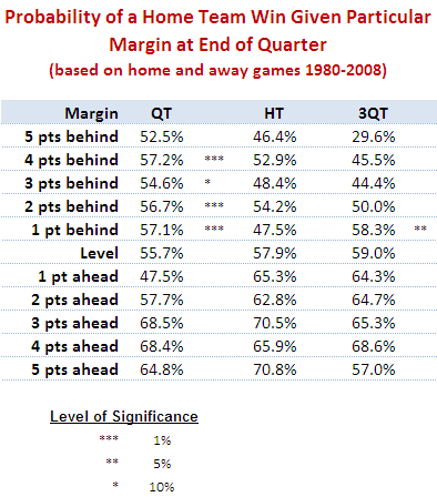
Put simply, there is some statistical evidence across the home-and-away matches from 1980 to 2008 that home teams that trail by between 1 and 4 points at quarter time, or by 1 point at three-quarter time, tend to win more often than they lose. There is no such statistical evidence for away teams.

The table below shows the proportion of times that the home team has won when leading or trailing by the amount shown at quarter time, half time or three-quarter time.

Home_Team_Wins_By_Lead_Short.png

It shows, for example, that home teams that trailed by exactly 5 points at quarter time went on to win 52.5% of such games.

Using standard statistical techniques I've been able to determine, based on the percentages in the table and the number of games underpinning each percentage, how likely it is that the "true" proportion of wins by the home team is greater than 50% for any of the entries in the table for which the home team trails. That analysis, for example, tells us that we can be 99% confident (since the significance level is 1%) that the figure of 57.2% for teams trailing by 4 points at quarter time is statistically above 50%.

(To look for a losing leads to winning phenomenon amongst away teams I've performed a similar analysis on the rows where the home team is ahead and tested whether the proportion of wins by the home team is statistically significantly less than 50%. None of the entries was found to be significant.)

My conclusion then is that, in AFL, it's less likely that being slightly behind is motivational. Instead, it's that the home ground advantage is sufficient for the home team to overcome small quarter time or three-quarter time deficits. It's important to make one other point: though home teams trailing do, in some cases, win more often that they lose, they do so at a rate less than their overall winning rate, which is about 58.5%.

So far we've looked only at narrow leads and small deficits. While we're here and looking at the data in this way, let's broaden the view to consider all leads and deficits.

Home_Team_Wins_By_Lead_Long.png

In this table I've grouped leads and deficits into 5-point bands. This serves to iron out some of the bumps we saw in the earlier, more granular table.

A few things strike me about this table:

  • Home teams can expect to overcome a small quarter time deficit more often than not and need only be level at the half or at three-quarter time in order to have better than even chances of winning. That said, even the smallest of leads for the away team at three-quarter time is enough to shift the away team's chances of victory to about 55%.
  • Apparently small differences have significant implications for the outcome. A late goal in the third term to extend a lead from say 4 to 10 points lifts a team's chances - all else being equal - by 10% points if it's the home team (ie from 64% to 74%) and by an astonishing 16% points if it's the away team (ie from 64% to 80%).
  • A home team that leads by about 2 goals at the half can expect to win 8 times out of 10. An away team with such a lead with a similar lead can expect to win about 7 times out of 10.

Does Losing Lead to Winning?

I was reading an issue of Chance News last night and came across the article When Losing Leads to Winning. In short, the authors of this journal article found that, in 6,300 or so most recent NCAA basketball games, teams that trailed by 1 point at half-time went on to win more games than they lost. This they attribute to "the motivational effects of being slightly behind".

Naturally, I wondered if the same effect existed for footy.

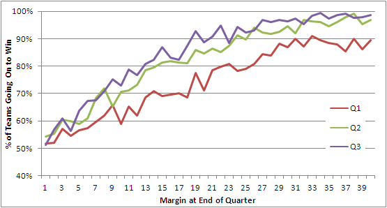
This first chart looks across the entire history of the VFL/AFL.

Leads and Winning - All Seasons.png

The red line charts the percentage of times that a team leading by a given margin at quarter time went on to win the game. You can see that, even at the leftmost extremity of this line, the proportion of victories is above 50%. So, in short, teams with any lead at quarter time have tended to win more than they've lost, and the larger the lead generally the greater proportion they've won. (Note that I've only shown leads from 1 to 40 points.)

Next, the green line charts the same phenomenon but does so instead for half-time leads. It shows the same overall trend but is consistently above the red line reflecting the fact that a lead at half-time is more likely to result in victory than is a lead of the same magnitude at quarter time. Being ahead is important; being ahead later in the game is more so.

Finally, the purple line charts the data for leads at three-quarter time. Once again we find that a given lead at three-quarter time is generally more likely to lead to victory than a similar lead at half-time, though the percentage point difference between the half-time and three-quarter lines is much less than that between the half-time and first quarter lines.

For me, one of the striking features of this chart is how steeply each line rises. A three-goal lead at quarter time has, historically, been enough to win around 75% of games, as has a two-goal lead at half-time or three-quarter time.

Anyway, there's no evidence of losing leading to winning if we consider the entire history of footy. What then if we look only at the period 1980 to 2008 inclusive?

Leads and Winning - 1980 to 2008.png

Now we have some barely significant evidence for a losing leads to winning hypothesis, but only for those teams losing by a point at quarter time (where the red line dips below 50%). Of the 235 teams that have trailed by one point at quarter time, 128 of them or 54.5% have gone on to win. If the true proportion is 50%, the likelihood of obtaining by chance a result of 128 or more wins is about 8.5%, so a statistician would deem that "significant" only if his or her preference was for critical values of 10% rather than the more standard 5%.

There is certainly no evidence for a losing leads to winning effect with respect to half-time or three-quarter time leads.

Before I created this second chart my inkling was that, with the trend to larger scores, larger leads would have been less readily defended, but the chart suggests otherwise. Again we find that a three-goal quarter time lead or a two-goal half-time or three-quarter time lead is good enough to win about 75% of matches.

Not content to abandon my preconception without a fight, I wondered if the period 1980 to 2008 was a little long and that my inkling was specific to more recent seasons. So, I divided up the 112-season history in 8 equal 14-year epochs and created the following table.

Leads and Winning - Table.png

The top block summarises the fates of teams with varying lead sizes, grouped into 5-point bands, across the 8 epochs. For example, teams that led by 1 to 5 points in any game played in the 1897 to 1910 period went on to win 55% of these games. Looking across the row you can see that this proportion has varied little across epochs never straying by more than about 3 percentage points from the all-season average of 54%.

There is some evidence in this first block that teams in the most-recent epoch have been better - not, as I thought, worse - at defending quarter time leads of three goals or more, but the evidence is slight.

Looking next at the second block there's some evidence of the converse - that is, that teams in the most-recent epoch have been poorer at defending leads, especially leads of a goal or more if you adjust for the distorting effect on the all-season average of the first two epochs (during which, for example, a four-goal lead at half-time should have been enough to send the fans to the exits).

In the third and final block there's a little more evidence of recent difficulty in defending leads, but this time it only relates to leads less than two goals at the final change.

All in all I'd have to admit that the evidence for a significant decline in the ability of teams to defend leads is not particularly compelling. Which, of course, is why I build models to predict football results rather than rely on my own inklings ...

Teams' Performances Revisited

In a comment on the previous posting, Mitch asked if we could take a look at each team's performance by era, his interest sparked by the strong all-time performance of the Blues and his recollection of their less than stellar recent seasons.

Here's the data:

All_Time_WDL_by_Epoch.png

So, as you can see, Carlton's performance in the most recent epoch is significantly below its all-time performance. In fact, the 1993-2008 epoch is the only one in which the Blues failed to return a better than 50% performance.

Collingwood, the only team with a better lifetime record than Carlton, have also had a well below par last epoch during which they too have registered their first sub-50% performance, continuing a downward trend which started back in Epoch 2.

Six current teams have performed significantly better in the 1993-2008 epoch than their all-time performance: Geelong (who registered their best ever epoch), Sydney (who cracked 50% for the first time in four epochs), Brisbane (who could hardly but improve), the Western Bulldogs (who are still yet to break 50% for an epoch, their 1945-1960 figure being actually 49.5%), North Melbourne (who also registered their best ever epoch),  and St Kilda (who still didn't manage 50% for the epoch, a feat they've achieved only once).

Just before we wind up I should note that the 0% for University in Epoch 2 is not an error. It's the consequence of two 0 and 18 performances by Uni in 1913 and 1914 which, given that these followed directly after successive 1 and 17 performances in 1911 and 1912, unsurprisingly heralded the club's demise. Given that Uni's sole triumph of 1912 came in the third round, by my calculations that means University lost its final 51 matches.

Teams' All-Time Records

At this time of year, before we fixate on the week-to-week triumphs and travesties of yet another AFL season, it's interesting to look at the varying fortunes of all the teams that have ever competed in the VFL/AFL.

The table below provides the Win, Draw and Loss records of every team.

All_Time_WDL.png

As you can see, Collingwood has the best record of all the teams having won almost 61% of all the games in which it has played, a full 1 percentage point better than Carlton, in second. Collingwood have also played more games than any other team and will be the first team to have played in 2,300 games when Round 5 rolls around this year.

Amongst the relative newcomers to the competition, West Coast and Port Adelaide - and to a lesser extent, Adelaide - have all performed well having won considerably more than half of their matches.

Sticking with newcomers but dipping down to the other end of the table we find Fremantle with a particularly poor record. They've won just under 40% of their games and, remarkably, have yet to register a draw. (Amongst current teams, Essendon have recorded the highest proportion of drawn games at 1.43%, narrowly ahead of Port Adelaide with 1.42%. After Fremantle, the team with the next lowest proportion of drawn games is Adelaide at 0.24%. In all, 1.05% of games have finished with scores tied.)

Lower still we find the Saints, a further 1.3 percentage points behind Fremantle. It took St Kilda 48 games before it registered its first win in the competition, which should surely have been some sort of a hint to fans of the pain that was to follow across two world wars and a depression (maybe two). Amongst those 112 seasons of pain there's been just the sole anaesthetising flag, in 1966.

Here then are a couple of milestones that we might witness this year that will almost certainly go unnoticed elsewhere:

  • Collingwood's 2,300th game (and 1,400th win or, if the season's a bad one for them, 900th loss)
  • Carlton's 900th loss
  • West Coast's 300th win
  • Port Adelaide's 300th game
  • Geelong's and Sydney's 2,200th game
  • Adelaide's 200th loss
  • Richmond's 1,000th loss (if they fail to win more than one match all season)
  • Fremantle's 200th loss

Granted, few of those are truly banner events, but if AFL commentators were as well supported by statisticians as, say, Major League Baseball, you can bet they'd get a mention, much as equally arcane statistics are sprinkled liberally in the 3 hours of dead time there is between pitches.