A Decade of Finals

This year represents the 10th under the current system of finals, a system I think has much to recommend it. It certainly seems to - justifiably, I'd argue - favour those teams that have proven their credentials across the entire season.

The table below shows how the finals have played out over the 10 years:

Finals_2009_W1.png

This next table summarises, on a one-week-of-the-finals-at-a-time basis, how teams from each ladder position have fared:

Finals_Summary_Wk1.png

Of particular note in relation to Week 1 of the finals is the performance of teams finishing 3rd and of those finishing 7th. Only two such teams - one from 3rd and one from 7th - have been successful in their respective Qualifying and Elimination Finals.

In the matchups of 1st v 4th and 5th v 8th the outcomes have been far more balanced. In the 1st v 4th clashes, it's been the higher ranked team that has prevailed on 6 of 10 occasions, whereas in the 5th v 8th clashes, it's been the lower ranked team that's won 60% of the time.

Turning our attention next to Week 2 of the finals, we find that the news isn't great for Adelaide or Lions fans. On both those occasions when 4th has met 5th in Week 2, the team from 4th on the ladder has emerged victorious, and on the 7 occasions that 3rd has faced 6th in Week 2, the team from 3rd on the ladder has won 5 and lost only 2.

Looking more generally at the finals, it's interesting to note that no team from ladder positions 5, 7 or 8 has made it through to the Preliminary Finals and, on the only two occasions that the team from position 6 has made it that far, none has progressed into the Grand Final.

So, teams only from positions 1 to 4 have so far contested Grand Finals, teams from 1st on 6 occasions, teams from 2nd on 7 occasions, teams from 3rd on 3 occasions, and teams from 4th only twice.

No team finishing lower than 3rd has yet won a Flag.

When Finalists Meet

If the teams in the finals are the best teams in the competition (and the MARS ratings say otherwise, but nonetheless) then it seems to make sense to focus on the games in which they've faced off in assessing each team's relative chances. The tables below have been constructed including just those games.

The first table provides the aggregate record of each team:

I'll come back and analyse this some more in a moment, but let me note a couple of interesting things here in passing:

  • Only 3 teams have a Percentage better than 100, and the third of them - the Dogs - only barely qualifies
  • The top 3 teams - on the ladder I've constructed here and on the competition ladder proper - met other teams in the final 8 on the fewest occasions - just 10 times each.

The second table provides summary information on the team matchups:

Now, looking at both tables together, let's consider the records of each team.

St Kilda

  • Have by far the best combined record against the other finalists, losing just 1 of 10 ten games, to the Dons in R20
  • Rank 1st on Points For and on Points Against
  • Have a Percentage almost 25 points better than any other team
  • Faced only 1 finalist in the last 5 rounds of the season

Geelong

  • Have the 2nd best combined record but it is only 6 and 4.
  • Faced 5 finalists in the second half of the season and lost 4 of them
  • Rank 2nd on Points For and 3rd on Points Against
  • Faced 3 finalists in the last 5 rounds of the season, winning 1 and losing 2
  • Have a 2 and 2 record against teams in the top 4

Western Bulldogs

  • Have a 5 and 5 record and, roughly, a Percentage of 100
  • Rank 3rd on Points For and 5th on Points Against
  • Faced only 4 finalists in the 1st half of the season, winning 1 and losing 3
  • Faced 6 finalists in the 2nd half of the season, winning 4 and losing 2
  • Faced finalists in all of the last 3 rounds and defeated them all
  • Have an 0 and 2 record against St Kilda
  • Have a 2 and 4 record against teams in the top 4

Collingwood

  • Have a 6 and 6 record and a Percentage just under 100
  • Are the only team to face 4 of the other finalists twice each
  • Rank 8th on Points For but 2nd on Points Against
  • Went 1 and 5 in the 1st half of the season, and 5 and 1 in the 2nd half
  • Faced 4 finalists in the last 6 rounds of the season, winning the first 3 - in a row, as it happpens - but losing the fourth.
  • Have a 1 and 3 record against teams in the top 4

Carlton

  • Have a 5 and 6 record and a Percentage around 90
  • Rank 4th on Points For but 8th on Points Against
  • Went 4 and 2 in the 1st half of the season, and 1 and 4 in the 2nd half
  • Faced only 3 finalists in the last 9 rounds of the season, winning only 1 of those contests
  • Have 0 and 2 records against Essendon and Adelaide
  • Have a 3 and 2 record against teams in the top 4

Essendon

  • Have a 4.5 and 6.5 record and a Percentage around 90
  • Rank 7th on Points For and on Points Against
  • Went 2 and 4 in the 1st half of the season, and 2.5 and 2.5 in the 2nd half
  • Faced only 2 finalists in the last 6 rounds of the season, winning 1 and drawing the other
  • Have a 2 and 0 record against Carlton
  • Have a 2 and 4 record against teams in the top 4

Adelaide

  • Have a 4 and 7 record and a Percentage around 90
  • Rank 5th on Points For and 6th on Points Against
  • Went 3 and 4 in the 1st half of the season, and 1 and 3 in the 2nd half
  • Have a 2 and 0 record against Carlton
  • Have a 0 and 2 record against St Kilda and against Geelong
  • Have a 1 and 6 record against teams in the top 4

Brisbane Lions

  • Have a 3.5 and 7.5 record and a Percentage around 90
  • Rank 8th on Points For but 4th on Points Against
  • Went 2 and 5 in the 1st half of the season, and 1.5 and 2.5 in the 2nd half
  • Have a 0 and 2 record against Collingwood and against Carlton
  • Have a 1 and 5 record against teams in the top 4

And the Last Shall be First (At Least Occasionally)

So far we've learned that handicap-adjusted margins appear to be normally distributed with a mean of zero and a standard deviation of 37.7 points. That means that the unadjusted margin - from the favourite's viewpoint - will be normally distributed with a mean equal to minus the handicap and a standard deviation of 37.7 points. So, if we want to simulate the result of a single game we can generate a random Normal deviate (surely a statistical contradiction in terms) with this mean and standard deviation.

Alternatively, we can, if we want, work from the head-to-head prices if we're willing to assume that the overround attached to each team's price is the same. If we assume that, then the home team's probability of victory is the head-to-head price of the underdog divided by the sum of the favourite's head-to-head price and the underdog's head-to-head price.

So, for example, if the market was Carlton $3.00 / Geelong $1.36, then Carlton's probability of victory is 1.36 / (3.00 + 1.36) or about 31%. More generally let's call the probability we're considering P%.

Working backwards then we can ask: what value of x for a Normal distribution with mean 0 and standard deviation 37.7 puts P% of the distribution on the left? This value will be the appropriate handicap for this game.

Again an example might help, so let's return to the Carlton v Geelong game from earlier and ask what value of x for a Normal distribution with mean 0 and standard deviation 37.7 puts 31% of the distribution on the left? The answer is -18.5. This is the negative of the handicap that Carlton should receive, so Carlton should receive 18.5 points start. Put another way, the head-to-head prices imply that Geelong is expected to win by about 18.5 points.

With this result alone we can draw some fairly startling conclusions.

In a game with prices as per the Carlton v Geelong example above, we know that 69% of the time this match should result in a Geelong victory. But, given our empirically-based assumption about the inherent variability of a football contest, we also know that Carlton, as well as winning 31% of the time, will win by 6 goals or more about 1 time in 14, and will win by 10 goals or more a litle less than 1 time in 50. All of which is ordained to be exactly what we should expect when the underlying stochastic framework is that Geelong's victory margin should follow a Normal distribution with a mean of 18.8 points and a standard deviation of 37.7 points.

So, given only the head-to-head prices for each team, we could readily simulate the outcome of the same game as many times as we like and marvel at the frequency with which apparently extreme results occur. All this is largely because 37.7 points is a sizeable standard deviation.

Well if simulating one game is fun, imagine the joy there is to be had in simulating a whole season. And, following this logic, if simulating a season brings such bounteous enjoyment, simulating say 10,000 seasons must surely produce something close to ecstasy.

I'll let you be the judge of that.

Anyway, using the Wednesday noon (or nearest available) head-to-head TAB Sportsbet prices for each of Rounds 1 to 20, I've calculated the relevant team probabilities for each game using the method described above and then, in turn, used these probabilities to simulate the outcome of each game after first converting these probabilities into expected margins of victory.

(I could, of course, have just used the line betting handicaps but these are posted for some games on days other than Wednesday and I thought it'd be neater to use data that was all from the one day of the week. I'd also need to make an adjustment for those games where the start was 6.5 points as these are handled differently by TAB Sportsbet. In practice it probably wouldn't have made much difference.)

Next, armed with a simulation of the outcome of every game for the season, I've formed the competition ladder that these simulated results would have produced. Since my simulations are of the margins of victory and not of the actual game scores, I've needed to use points differential - that is, total points scored in all games less total points conceded - to separate teams with the same number of wins. As I've shown previously, this is almost always a distinction without a difference.

Lastly, I've repeated all this 10,000 times to generate a distribution of the ladder positions that might have eventuated for each team across an imaginary 10,000 seasons, each played under the same set of game probabilities, a summary of which I've depicted below. As you're reviewing these results keep in mind that every ladder has been produced using the same implicit probabilities derived from actual TAB Sportsbet prices for each game and so, in a sense, every ladder is completely consistent with what TAB Sportsbet 'expected'.

Simulated Seasons.png

The variability you're seeing in teams' final ladder positions is not due to my assuming, say, that Melbourne were a strong team in one season's simulation, an average team in another simulation, and a very weak team in another. Instead, it's because even weak teams occasionally get repeatedly lucky and finish much higher up the ladder than they might reasonably expect to. You know, the glorious uncertainty of sport and all that.

Consider the row for Geelong. It tells us that, based on the average ladder position across the 10,000 simulations, Geelong ranks 1st, based on its average ladder position of 1.5. The barchart in the 3rd column shows the aggregated results for all 10,000 simulations, the leftmost bar showing how often Geelong finished 1st, the next bar how often they finished 2nd, and so on.

The column headed 1st tells us in what proportion of the simulations the relevant team finished 1st, which, for Geelong, was 68%. In the next three columns we find how often the team finished in the Top 4, the Top 8, or Last. Finally we have the team's current ladder position and then, in the column headed Diff, a comparison of the each teams' current ladder position with its ranking based on the average ladder position from the 10,000 simulations. This column provides a crude measure of how well or how poorly teams have fared relative to TAB Sportsbet's expectations, as reflected in their head-to-head prices.

Here are a few things that I find interesting about these results:

  • St Kilda miss the Top 4 about 1 season in 7.
  • Nine teams - Collingwood, the Dogs, Carlton, Adelaide, Brisbane, Essendon, Port Adelaide, Sydney and Hawthorn - all finish at least once in every position on the ladder. The Bulldogs, for example, top the ladder about 1 season in 25, miss the Top 8 about 1 season in 11, and finish 16th a little less often than 1 season in 1,650. Sydney, meanwhile, top the ladder about 1 season in 2,000, finish in the Top 4 about 1 season in 25, and finish last about 1 season in 46.
  • The ten most-highly ranked teams from the simulations all finished in 1st place at least once. Five of them did so about 1 season in 50 or more often than this.
  • Every team from ladder position 3 to 16 could, instead, have been in the Spoon position at this point in the season. Six of those teams had better than about a 1 in 20 chance of being there.
  • Every team - even Melbourne - made the Top 8 in at least 1 simulated season in 200. Indeed, every team except Melbourne made it into the Top 8 about 1 season in 12 or more often.
  • Hawthorn have either been significantly overestimated by the TAB Sportsbet bookie or deucedly unlucky, depending on your viewpoint. They are 5 spots lower on the ladder than the simulations suggest that should expect to be.
  • In contrast, Adelaide, Essendon and West Coast are each 3 spots higher on the ladder than the simulations suggest they should be.

(In another blog I've used the same simulation methodology to simulate the last two rounds of the season and project where each team is likely to finish.)

Game Cadence

If you were to consider each quarter of football as a separate contest, what pattern of wins and losses do you think has been most common? Would it be where one team wins all 4 quarters and the other therefore losses all 4? Instead, might it be where teams alternated, winning one and losing the next, or vice versa? Or would it be something else entirely?

The answer, it turns out, depends on the period of history over which you ask the question. Here's the data:

Game Cadence.png

So, if you consider the entire expanse of VFL/AFL history, the egalitarian "WLWL / LWLW" cadence has been most common, occurring in over 18% of all games. The next most common cadence, coming in at just under 15% is "WWWW / LLLL" - the Clean Sweep, if you will. The next four most common cadences all have one team winning 3 quarters and the other winning the remaining quarter, each of which such cadences have occurred about 10-12% of the time. The other patterns have occurred with frequencies as shown under the 1897 to 2009 columns, and taper off to the rarest of all combinations in which 3 quarters were drawn and the other - the third quarter as it happens - was won by one team and so lost by the other. This game took place in Round 13 of 1901 and involved Fitzroy and Collingwood.

If, instead, you were only to consider more recent seasons excluding the current one, say from 1980 to 2008, you'd find that the most common cadence has been the Clean Sweep on about 18%, with the "WLLL / "LWWW" cadence in second on a little over 12%. Four other cadences then follow in the 10-11.5% range, three of them involving one team winning 3 of the 4 quarters and the other the "WLWL / LWLW" cadence.

In short it seems that teams have tended to dominate contests more in the 1980 to 2008 period than had been the case historically.

(It's interesting to note that, amongst those games where the quarters are split 2 each, "WLWL / LWLW" is more common than either of the two other possible cadences, especially across the entire history of footy.)

Turning next to the current season, we find that the Clean Sweep has been the most common cadence, but is only a little ahead of 5 other cadences, 3 of these involving a 3-1 split of quarters and 2 of them involving a 2-2 split.

So, 2009 looks more like the period 1980 to 2008 than it does the period 1897 to 2009.

What about the evidence for within-game momentum in the quarter-to-quarter cadence? In other words, are teams who've won the previous quarter more or less likely to win the next?

Once again, the answer depends on your timeframe.

Across the period 1897 to 2009 (and ignoring games where one of the two relevant quarters was drawn):

  • teams that have won the 1st quarter have also won the 2nd quarter about 46% of the time
  • teams that have won the 2nd quarter have also won the 3rd quarter about 48% of the time
  • teams that have won the 3rd quarter have also won the 4th quarter just under 50% of the time.

So, across the entire history of football, there's been, if anything, an anti-momentum effect, since teams that win one quarter have been a little less likely to win the next.

Inspecting the record for more recent times, however, consistent with our earlier conclusion about the greater tendency for teams to dominate matches, we find that, for the periods 1980 to 2008 (and, in brackets, for 2009):

  • teams that have won the 1st quarter have also won the 2nd quarter about 52% of the time a little less in 2009)
  • teams that have won the 2nd quarter have also won the 3rd quarter about 55% of the time (a little more in 2009)
  • teams that have won the 3rd quarter have also won the 4th quarter just under 55% of the time (but only 46% for 2009).

In more recent history then, there is evidence of within-game momentum.

All of which would lead you to believe that winning the 1st quarter should be particularly important, since it gets the momentum moving in the right direction right from the start. And, indeed, this season that has been the case, as teams that have won matches have also won the 1st quarter in 71% of those games, the greatest proportion of any quarter.

July - When a Fan's Thoughts Turn to Tanking

Most major Australian sports have their iconic annual event. Cricket has its Boxing Day test, tennis and golf have their respective Australian Opens, rugby league has the State of Origin series, rugby union the Bledisloe, and AFL, it now seems, has the Tanking Debate, usually commencing near Round 15 or 16 and running to the end of the season proper.

The T-word has been all over the Melbourne newspapers and various footy websites this week, perhaps most startlingly in the form of Terry Wallace's admission that in Round 22 of 2007 in the Tigers clash against St Kilda, a game in which the Tigers led by 3 points at the final change but went on to lose by 10 points:

"while he had not "tanked" during the Trent Cotchin game in Round 22, 2007, he had let the contest run its natural course without intervention"

That stain on the competition's reputation (coupled, I'll admit, with he realisation that the loss cost MAFL Investors an additional return of about 13% for that year) makes it all the more apparent to me that the draft system, especially the priority draft component, must change.

Here's what I wrote on the topic - presciently as it turns out - in the newsletter for Round 19 of 2007.

Tanking and the Draft

If you’re a diehard AFL fan and completely conversant with the nuances of the Draft, please feel free to skip this next section of the newsletter.

I thought that a number of you might be interested to know why, in some quarters, there’s such a fuss around this time of year about “The Draft” and its potential impact on the commitment levels of teams towards the bottom of the ladder.

The Draft is, as Wikipedia puts it, the “annual draft of young talent” into the AFL that takes place prior to the start of each season. In the words of the AFL’s own website:

"In simple terms, the NAB AFL Draft is designed to give clubs which finished lower on the ladder the first opportunity to pick the best new talent in Australia. At season's end, all clubs are allocated draft selections. The club that finished last receives the first selection, the second last team gets the second selection and so on until the premier receives the 16th selection."

So, here’s the first issue: towards season’s end, those teams for whom all hopes of a Finals berth have long since left the stadium find that there’s more to be gained by losing games than there is by winning them.

Why? Well say, for example, that Richmond suddenly remembered what the big sticks are there for and jagged two wins in the last four games, leaping a startled Melbourne in the process, relegating them to position Spoon. The Tigers’ reward for such a stunning effort would be to (possibly – see below) hand Melbourne the sweetest of draft plums, the Number 1 draft pick, while relegating themselves to the Number 2 pick. Now, in truth, over the years, Number 1 picks have not always worked out better than Number 2 picks, but think about it this way: isn’t it always nicer to have first hand into the Quality Assortment?

Now entereth the notion of Priority Picks, which accrue to those teams who have demonstrated season-long ineptitude to the extent that they’ve accumulated fewer than 17 points over its duration. They get a second draft pick prior to everyone else’s second draft pick and then a third pick not that long after, once all the other Priority Picks have taken place. So, for example, if a team comes last and wins, say, four games, it gets Pick #1, Pick #17 (their Priority pick, immediately after all the remaining teams have had their first pick) and then Pick #18 (their true second round Pick). If more than one team is in entitled to Priority Picks then the Picks are taken in reverse ladder order.

Still with me?

Now, the final twist. If a team has proven its footballing inadequacy knows not the bounds of a single year, having done so by securing fewer than 17 points in each of two successive seasons, then it gets its Priority Pick before anyone else gets even their first round pick. Once again, if more than one team is in this situation, then the tips are taken in reverse ladder order.

So, what’s the relevance to this year? Well, last year Carlton managed only 14 points and this year they’re perched precipitously on 16 points. If they lose their next four games, their first three draft picks will be #1 (their Priority Pick), #4 (their first round pick), and #20 (their second round pick); if they win or even draw one or more of their remaining games and do this without leaping a ladder spot, their first three draft picks will be #3, #19 and #35. Which would you prefer?

I find it hard to believe that a professional footballer or coach could ever succumb to the temptation to “tank” games (as it’s called), but the game’s administrators should never have set up the draft process in such a way that it incites such speculation every year around this time.

I can think of a couple of ways of preserving the intent of the current draft process without so blatantly rewarding failure and inviting suspicion and rumour. We’ll talk about this some more next week.

*****

In the following week's newsletter, I wrote this:

Revising the Draft

With the Tigers and the Dees winning last week, I guess many would feel that the “tanking” issue has been cast aside for yet another season. Up to a point, that’s probably a fair assessment, although only a win by the Blues could truly muffle all the critics.

Regardless, as I said last week, it’s unfair to leave any of the teams in a position where they could even be suspected of putting in anything other than a 100% effort.

I have two suggestions for changes to the draft that would broadly preserve its intent but that would also go a long way to removing much of the contention that currently exists.

(1) Randomise the draft to some extent.

Sure, give teams further down the ladder a strong chance of getting early draft picks, but don’t make ladder position completely determine the pick order. One way to achieve this would be to place balls in an urn with the number of balls increasing as ladder position increased. So, for example, the team that finished 9th might get 5 balls in the urn; 10th might get 6 balls, and so on. Then, draw from this urn to determine the order of draft picks.

Actually, although it’s not strictly in keeping with the current spirit of the draft, I’d like to see this system used in such a way that marginally more balls are placed in the urn for teams higher up the ladder to ensure that all teams are still striving for victory all the way to Round 22.

(2) Base draft picks on ladder position at the end of Round 11, not Round 22.

Sides that are poor performers generally don’t need 22 rounds to prove it; 11 rounds should be more than enough. What’s more, I reckon that it’s far less likely that a team would even consider tanking say rounds 9, 10 and 11 when there’s still so much of the season to go that a spot in the Finals is not totally out of the question. With this approach I’d be happy to stick with the current notion that 1st draft pick accrues to the team at the foot at the ladder.

Under either of these new draft regimes, the notion of Priority Picks has to go. Let’s compensate for underperformance but not lavish it with silken opportunity.

****

My opinion hasn't changed. The changes to the draft for the next few years that have been made to smooth the entry of the Gold Coast into the competition probably mean that we're stuck with a version of the draft we have now for the next few years. After that though, we do have to fix it because it is broken.

The Differential Difference

Though there are numerous differences between the various football codes in Australia, two that have always struck me as arbitrary are AFL's awarding of 4 points for a victory and 2 from a draw (why not, say, pi and pi/2 if you just want to be different?) and AFL's use of percentage rather than points differential to separate teams that are level on competition points.

I'd long suspected that this latter choice would only rarely be significant - that is, that a team with a superior percentage would not also enjoy a superior points differential - and thought it time to let the data speak for itself.

Sure enough, a review of the final competition ladders for all 112 seasons, 1897 to 2008, shows that the AFL's choice of tiebreaker has mattered only 8 times and that on only 3 of those occasions (shown in grey below) has it had any bearing on the conduct of the finals.

PC v FA.png

Historically, Richmond has been the greatest beneficiary of the AFL's choice of tiebreaker, being awarded the higher ladder position on the basis of percentage on 3 occasions when the use of points differential would have meant otherwise. Essendon and St Kilda have suffered most from the use of percentage, being consigned to a lower ladder position on 2 occasions each.

There you go: trivia that even a trivia buff would dismiss as trivial.

The Decline of the Humble Behind

Last year, you might recall, a spate of deliberately rushed behinds prompted the AFL to review and ultimately change the laws relating to this form of scoring.

Has the change led to a reduction in the number of behinds recorded in each game? The evidence is fairly strong:

Goals and Behinds.png

So far this season we've seen 22.3 behinds per game, which is 2.6 per game fewer than we saw in 2008 and puts us on track to record the lowest number of average behinds per game since 1915. Back then though goals came as much more of a surprise, so a spectator at an average game in 1915 could expect to witness only 16 goals to go along with the 22 behinds. Happy days.

This year's behind decline continues a trend during which the number of behinds per game has dropped from a high of 27.3 per game in 1991 to its current level, a full 5 behinds fewer, interrupted only by occasional upticks such as the 25.1 behinds per game recorded in 2007 and the 24.9 recorded in 2008.

While behind numbers have been falling recently, goals per game have also trended down - from 29.6 in 1991, to this season's current average of 26.8. Still, AFL followers can expect to witness more goals than behinds in most games they watch. This wasn't always the case. Not until the season of 1969 had there been a single season with more goals than behinds, and not until 1976 did such an outcome became a regular occurrence. In only one season since then, 1981, have fans endured more behinds than goals across the entire season.

On a game-by-game basis, 90 of 128 games this season, or a smidge over 70%, have produced more goals than behinds. Four more games have produced an equal number of each.

As a logical consequence of all these trends, behinds have had a significantly smaller impact on the result of games, as evidenced by the chart below which shows the percentage of scoring attributable to behinds falling from above 20% in the very early seasons to around 15% across the period 1930 to 1980, to this season's 12.2%, the second-lowest percentage of all time, surpassed only by the 11.9% of season 2000.

Behinds PC.png

(There are more statistical analyses of the AFL on MAFL Online's sister site at MAFL Stats.)

Does The Favourite Have It Covered?

You've wagered on Geelong - a line bet in which you've given 46.5 points start - and they lead by 42 points at three-quarter time. What price should you accept from someone wanting to purchase your wager? They also led by 44 points at quarter time and 43 points at half time. What prices should you have accepted then?

In this blog I've analysed line betting results since 2006 and derived three models to answer questions similar the one above. These models take as inputs the handicap offered by the favourite and the favourite's margin relative to that handicap at a particular quarter break. The output they provide is the probability that the favourite will go on to cover the spread given the situation they find themselves in at the end of some quarter.

The chart below plots these probabilities against margins relative to the spread at quarter time for 8 different handicap levels.

Cover_Q1_Chart.png

Negative margins mean that the favourite has already covered the spread, positive margins that there's still some spread to be covered.

The top line tracks the probability that a 47.5 point favourite covers the spread given different margins relative to the spread at quarter time. So, for example, if the favourite has the spread covered by 5.5 points (ie leads by 53 points) at quarter time, there's a 90% chance that the favourite will go on to cover the spread at full time.

In comparison, the bottom line tracks the probability that a 6.5 point favourite covers the spread given different margins relative to the spread at quarter time. If a favourite such as this has the spread covered by 5.5 points (ie leads by 12 points) at quarter time, there's only a 60% chance that this team will go on to cover the spread at full time. The logic of this is that a 6.5 point favourite is, relatively, less strong than a 47.5 point favourite and so more liable to fail to cover the spread for any given margin relative to the spread at quarter time.

Another way to look at this same data is to create a table showing what margin relative to the spread is required for an X-point favourite to have a given probability of covering the spread.

Cover_Q1_Table.png

So, for example, for the chances of covering the spread to be even, a 6.5 point favourite can afford to lead by only 4 or 5 (ie be 2 points short of covering) at quarter time and a 47.5 point favourite can afford to lead by only 8 or 9 (ie be 39 points short of covering).

The following diagrams provide the same chart and table for the favourite's position at half time.

Cover_Q2_Chart.png
Cover_Q2_Table.png

Finally, these next diagrams provide the same chart and table for the favourite's position at three-quarter time.

Cover_Q3_Chart.png
Cover_Q3_Table.png

I find this last table especially interesting as it shows how fine the difference is at three-quarter time between likely success and possible failure in terms of covering the spread. The difference between a 50% and a 75% probability of covering is only about 9 points and between a 75% and a 90% probability is only 9 points more.

To finish then, let's go back to the question with which I started this blog. A 46.5 point favourite leading by 42 points at three-quarter time is about a 69.4% chance to go on and cover. So, assuming you backed the favourite at $1.90 your expected payout for a 1 unit wager is 0.694 x 0.9 - 0.306 = +0.32 units. So, you'd want to be paid 1.32 units for your wager, given that you also want your original stake back too.

A 46.5 point favourite leading by 44 points at quarter time is about an 85.5% chance to go on and cover, and a similar favourite leading by 43 points at half time is about an 84.7% chance to go on to cover. The expected payouts for these are +0.62 and +0.61 units respectively, so you'd have wanted about 1.62 units to surrender these bets (a little more if you're a risk-taker and a little less if you're risk-averse, but that's a topic for another day ...)

Are Footy HAMs Normal?

Okay, this is probably going to be a long blog so you might want to make yourself comfortable.

For some time now I've been wondering about the statistical properties of the Handicap-Adjusted Margin (HAM). Does it, for example, follow a normal distribution with zero mean?

Well firstly we need to deal with the definition of the term HAM, for which there is - at least - two logical definitions.

The first definition, which is the one I usually use, is calculated from the Home Team perspective and is Home Team Score - Away Team Score + Home Team's Handicap (where the Handicap is negative if the Home Team is giving start and positive otherwise). Let's call this Home HAM.

As an example, if the Home Team wins 112 to 80 and was giving 20.5 points start, then Home HAM is 112-80-20.5 = +11.5 points, meaning that the Home Team won by 11.5 points on handicap.

The other approach defines HAM in terms of the Favourite Team and is Favourite Team Score - Underdog Team Score + Favourite Team's Handicap (where the Handicap is always negative as, by definition the Favourite Team is giving start). Let's call this Favourite HAM.

So, if the Favourite Team wins 82 to 75 and was giving 15.5 points start, then Favourite HAM is 82-75-15.5 = -7.5 points, meaning that the Favourite Team lost by 7.5 points on handicap.

Home HAM will be the same as Favourite HAM if the Home Team is Favourite. Otherwise Home HAM and Favourite HAM will have opposite signs.

There is one other definitional detail we need to deal with and that is which handicap to use. Each week a number of betting shops publish line markets and they often differ in the starts and the prices offered for each team. For this blog I'm going to use TAB Sportsbet's handicap markets.

TAB Sportsbet Handicap markets work by offering even money odds (less the vigorish) on both teams, with one team receiving start and the other offering that same start. The only exception to this is when the teams are fairly evenly matched in which case the start is fixed at 6.5 points and the prices varied away from even money as required. So, for example, we might see Essendon +6.5 points against Carlton but priced at $1.70 reflecting the fact that 6.5 points makes Essendon in the bookie's opinion more likely to win on handicap than to lose. Games such as this are problematic for the current analysis because the 'true' handicap is not 6.5 points but is instead something less than 6.5 points. Including these games would bias the analysis - and adjusting the start is too complex - so we'll exclude them.

So, the question now becomes is HAM Home, defined as above and using the TAB Sportsbet handicap and excluding games with 6.5 points start or fewer, normally distributed with zero mean? Similarly, is HAM Favourite so distributed?

We should expect HAM Home and HAM Favourite to have zero means because, if they don't it suggests that the Sportsbet bookie has a bias towards or against Home teams of Favourites. And, as we know, in gambling, bias is often financially exploitable.

There's no particular reason to believe that HAM Home and HAM Favourite should follow a normal distribution, however, apart from the startling ubiquity of that distribution across a range of phenomena.

Consider first the issue of zero means.

The following table provides information about Home HAMs for seasons 2006 to 2008 combined, for season 2009, and for seasons 2006 to 2009. I've isolated this season because, as we'll see, it's been a slightly unusual season for handicap betting.

Home_HAM.png

Each row of this table aggregates the results for different ranges of Home Team handicaps. The first row looks at those games where the Home Team was offering start of 30.5 points or more. In these games, of which there were 53 across seasons 2006 to 2008, the average Home HAM was 1.1 and the standard deviation of the Home HAMs was 39.7. In season 2009 there have been 17 such games for which the average Home HAM has been 14.7 and the standard deviation of the Home HAMs has been 29.1.

The asterisk next to the 14.7 average denotes that this average is statistically significantly different from zero at the 10% level (using a two-tailed test). Looking at other rows you'll see there are a handful more asterisks, most notably two against the 12.5 to 17.5 points row for season 2009 denoting that the average Home HAM of 32.0 is significant at the 5% level (though it is based on only 8 games).

At the foot of the table you can see that the overall average Home HAM across seasons 2006 to 2008 was, as we expected approximately zero. Casting an eye down the column of standard deviations for these same seasons suggests that these are broadly independent of the Home Team handicap, though there is some weak evidence that larger absolute starts are associated with slightly larger standard deviations.

For season 2009, the story's a little different. The overall average is +8.4 points which, the asterisks tell us, is statistically significantly different from zero at the 5% level. The standard deviations are much smaller and, if anything, larger absolute margins seem to be associated with smaller standard deviations.

Combining all the seasons, the aberrations of 2009 are mostly washed out and we find an average Home HAM of just +1.6 points.

Next, consider Favourite HAMs, the data for which appears below:

Favourite_HAM.png

The first thing to note about this table is the fact that none of the Favourite HAMs are significantly different from zero.

Overall, across seasons 2006 to 2008 the average Favourite HAM is just 0.1 point; in 2009 it's just -3.7 points.

In general there appears to be no systematic relationship between the start given by favourites and the standard deviation of the resulting Favourite HAMs.

Summarising:

  • Across seasons 2006 to 2009, Home HAMs and Favourite HAMs average around zero, as we hoped
  • With a few notable exceptions, mainly for Home HAMs in 2009, the average is also around zero if we condition on either the handicap given by the Home Team (looking at Home HAMs) or that given by the Favourite Team (looking at Favourite HAMs).

Okay then, are Home HAMs and Favourite HAMs normally distributed?

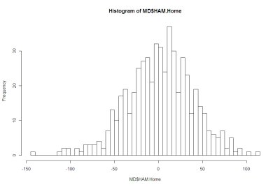
Here's a histogram of Home HAMs:

Home_HAM_Pic.png

And here's a histogram of Favourite HAMs:

Favourite_HAM_Pic.png

There's nothing in either of those that argues strongly for the negative.

More formally, Shapiro-Wilks tests fail to reject the null hypothesis that both distributions are Normal.

Using this fact, I've drawn up a couple of tables that compare the observed frequency of various results with what we'd expect if the generating distributions were Normal.

Here's the one for Home HAMs:

Home_HAM_Table.png

There is a slight over-prediction of negative Home HAMs and a corresponding under-prediction of positive Home HAMs but, overall, the fit is good and the appropriate Chi-Squared test of Goodness of Fit is passed.

And, lastly, here's the one for Home Favourites:

Favourite_HAM_Table.png

In this case the fit is even better.

We conclude then that it seems reasonable to treat Home HAMs as being normally distributed with zero mean and a standard deviation of 37.7 points and to treat Favourite HAMs as being normally distributed with zero mean and, curiously, the same standard deviation. I should point out for any lurking pedant that I realise neither Home HAMs nor Favourite HAMs can strictly follow a normal distribution since Home HAMs and Favourite HAMs take on only discrete values. The issue really is: practically, how good is the approximation?

This conclusion of normality has important implications for detecting possible imbalances between the line and head-to-head markets for the same game. But, for now, enough.

Another Look At Quarter-by-Quarter Performance

It's been a while since we looked at teams' quarter-by-quarter performances. This blog looks to redress this deficiency.

(By the way, the Alternative Premierships data is available as a PDF download on the MAFL Stats website .)

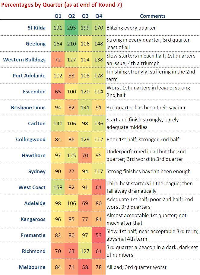
The table below includes each teams' percentage by quarter and its win-draw-lose record by quarter as at the end of the 14th round:

(The comments in the right-hand column in some cases make comparisons to a team's performance after Round 7. This was the subject of an earlier blog.)

Geelong, St Kilda and, to a lesser extent, Adelaide, are the kings/queens of the 1st quarter. The Cats and the Saints have both won 11 of 14 first terms, whereas the Crows, despite recording an impressive 133 percentage, have won just 8 of 14, a record that surprisingly has been matched by the 11th-placed Hawks. The Hawks however, when bad have been very, very bad, and so have a 1st quarter percentage of just 89.

Second quarters have been the province of the ladder's top 3 teams. The Saints have the best percentage (176) but the Cats have the best win-draw-lose record (10-1-3). Carlton, though 7th on the ladder, have the 5th best percentage in 2nd quarters and the equal-2nd best win-draw-lose record.

St Kilda have also dominated in the 3rd quarter racking up a league-best percentage of 186 and a 10-0-4 win-draw-lose record. Geelong and Collingwood have also established 10-0-4 records in this quarter. The Lions, though managing only a 9-1-4 win-draw-lose record, have racked up the second-best percentage in the league for this quarter (160).

Final terms, which have been far less important this year than in seasons past, have been most dominated by St Kilda and the Bulldogs in terms of percentage, and by the Dogs and Carlton in terms of win-draw-lose records.

As you'd expect, the poorer teams have tended to do poorly across all terms, though some better-positioned teams have also had troublesome quarters.

For example, amongst those teams in the ladder's top 8 or thereabouts, the Lions, the Dons and Port have all generally failed to start well, recording sub-90 percentages and 50% or worse win-draw-lose performances.

The Dons and Sydney have both struggled in 2nd terms, winning no more than 5 of them and, in the Dons' case, also drawing one.

Adelaide and Port have found 3rd terms most disagreeable, winning only, respectively, 6 and 5 of them and in so doing producing percentages of around 75.

No top-ranked team has truly flopped in the final term, though the Lions' performance is conspicuous because it has resulted in a sub-100 percentage and a 6-0-8 win-draw-lose record.

Finally, in terms of quarters won, Geelong leads on 39 followed by the Saints on 38. There's then a gap back to the Dogs and the Pies on 32.5, and then Carlton, somewhat surprisingly given its ladder position, on 32. Melbourne have only the 3rd worst performance in terms of total quarters won. They're on 19.5, ahead of Richmond on 19 and the Roos on just 16.5. That means, in an average game, the Roos can be expected to win just 1.2 quarters. Eleven of the 16.5 quarters won have come in the first half of games so, to date anyway, Roos supporters could comfortably leave at the main change without much risk of missing a winning Roos quarter or half.

AFL Players Don't Shave

In a famous - some might say, infamous - paper by Wolfers he analysed the results of 44,120 NCAA Division I basketball games on which public betting was possible, looking for signs of "point shaving".

Point shaving occurs when a favoured team plays well enough to win, but deliberately not quite well enough to cover the spread. In his first paragraph he states: "Initial evidence suggests that point shaving may be quite widespread". Unsurprisingly, such a conclusion created considerable alarm and led, amongst a slew of furious rebuttals, to a paper by sabermetrician Phil Birnbaum refuting Wolfers' claim. This, in turn, led to a counter-rebuttal by Wolfers.

Wolfers' claim is based on a simple finding: in the games that he looked at, strong favourites - which he defines as those giving more than 12 points start - narrowly fail to cover the spread significantly more often than they narrowly cover the spread. The "significance" of the difference is in a statistical sense and relies on the assumption that the handicap-adjusted victory margin for favourites has a zero mean, normal distribution.

He excludes narrow favourites from his analysis on the basis that, since they give relatively little start, there's too great a risk that an attempt at point-shaving will cascade into a loss not just on handicap but outright. Point-shavers, he contends, are happy to facilitate a loss on handicap but not at the risk of missing out on the competition points altogether and of heightening the levels of suspicion about the outcome generally.

I have collected over three-and-a-half seasons of TAB Sporsbet handicapping data and results, so I thought I'd perform a Wolfers style analysis on it. From the outset I should note that one major drawback of performing this analysis on the AFL is that there are multiple line markets on AFL games and they regularly offer different points start. So, any conclusions we draw will be relevant only in the context of the starts offered by TAB Sportsbet. A "narrow shaving" if you will.

In adapting Wolfers' approach to AFL I have defined a "strong favourite" as a team giving more than 2 goals start though, from a point-shaving perspective, the conclusion is the same if we define it more restrictively. Also, I've defined "narrow victory" with respect to the handicap as one by less than 6 points. With these definitions, the key numbers in the table below are those in the box shaded grey.

Point_Shaving.png

These numbers tell us that there have been 27(13+4+10) games in which the favourite has given 12.5 points or more start and has won, by has won narrowly by enough to cover the spread. As well, there have been 24(11+7+6) games in which the favourite has given 12.5 points or more start and has won, but has narrowly not won by enough to cover the spread. In this admittedly small sample of just 51 games, there is then no statistical evidence at all of any point-shaving going on. In truth if there was any such behaviour occurring it would need to be near-endemic to show up in a sample this small lest it be washed out by the underlying variability.

So, no smoking gun there - not even a faint whiff of gunpowder ...

The table does, however, offer one intriguing insight, albeit that it only whispers it.

The final column contains the percentage of the time that favourites have managed to cover the spread for the given range of handicaps. So, for example, favourites giving 6.5 points start have covered the spread 53% of the time. Bear in mind that these percentages should be about 50%, give or take some statistically variability, lest they be financially exploitable.

It's the next percentage down that's the tantalising one. Favourites giving 7.5 to 11.5 points start have, over the period 2006 to Round 13 of 2009, covered the spread only 41% of the time. That percentage is statistically significantly different from 50% at roughly the 5% level (using a two-tailed test in case you were wondering). If this failure to cover continues at this rate into the future, that's a seriously exploitable discrepancy.

To check if what we've found is merely a single-year phenomenon, let's take a look at the year-by-year data. In 2006, 7.5-to 11.5-point favourites covered on only 12 of 35 occasions (34%). In 2007, they covered in 17 of 38 (45%), while in 2008 they covered in 12 of 28 (43%). This year, to date they've covered in 6 of 15 (40%). So there's a thread of consistency there. Worth keeping an eye on, I'd say.

Another striking feature of this final column is how the percentage of time that the favourites cover tends to increase with the size of the start offered and only crosses 50% for the uppermost category, suggesting perhaps a reticence on the part of TAB Sportsbet to offer appropriately large starts for very strong favourites. Note though that the discrepancy for the 24.5 points or more category is not statistically significant.

When the Low Scorer Wins

One aspect of the unusual predictability of this year's AFL results has gone - at least to my knowledge - unremarked.

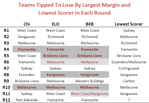
That aspect is the extent to which the week's low-scoring team has been the team receiving the most points start on Sportsbet. Following this strategy would have been successful in six of the last eight rounds, albeit that in one of those rounds there were joint low-scorers and, in another, there were two teams both receiving the most start.

The table below provides the detail and also shows the teams that Chi and ELO would have predicted as the low scorers (proxied by the team they selected to lose by the biggest margin). Correct predictions are shaded dark grey. "Half right" predictions - where there's a joint prediction, one of which is correct, or a joint low-scorer, one of which was predicted - are shaded light grey.

Lowest Scorer.png

To put the BKB performance in context, here's the data for seasons 2006 to 2009.

Low Scorer History.png

All of which might appear to amount to not much until you understand that Sportsbet fields a market on the round's lowest scorer. So we should keep an eye on this phenomenon in subsequent weeks to see if the apparent lift in the predictability of the low scorer is a statistical anomaly or something more permanent and exploitable. In fact, there might still be a market opportunity even if historical rates of predictiveness prevail, provided the average payoff is high enough.

A Game of Four Quarters?

I was reviewing the data in the Alternative Premierships file and thought I'd share a quick analysis of it with you.

I've jotted down some pen notes against each team, which I'll leave as an (eye) exercise for you to read. Looking at some of the broader trends, it's interesting to note how poorly some of the teams currently in the top 6 have performed in at least one quarter. Brisbane is the best example of this, having recorded an average sub-100 percentage in all but the 3rd quarter of its games yet doing enough on the strength of this to be placed 6th on the ladder.

Further down the table we find the converse, with generally poorly performing teams nonetheless returning solid results in one quarter of their games. West Coast, for example, has a 158 percentage in 1st quarters, but lies 11th, and Richmond has a 127 percentage in 3rd quarters, but lies 15th.

Losing Does Lead to Winning But Only for Home Teams (and only sometimes)

For reasons that aren't even evident to me, I decided to revisit the issue of "when losing leads to winning", which I looked at a few blogs back.

In that earlier piece no distinction was made between which team - home or away - was doing the losing or the winning. Such a distinction, it turns out, is important in uncovering evidence for the phenomenon in question.

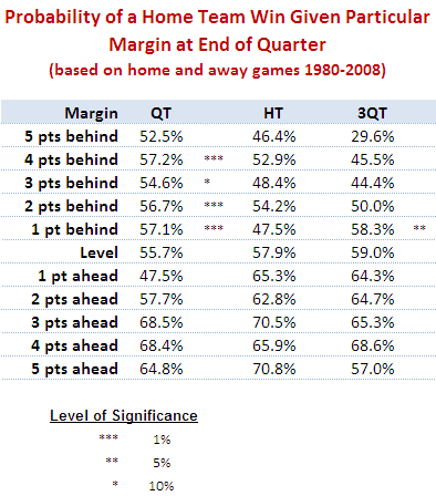
Put simply, there is some statistical evidence across the home-and-away matches from 1980 to 2008 that home teams that trail by between 1 and 4 points at quarter time, or by 1 point at three-quarter time, tend to win more often than they lose. There is no such statistical evidence for away teams.

The table below shows the proportion of times that the home team has won when leading or trailing by the amount shown at quarter time, half time or three-quarter time.

Home_Team_Wins_By_Lead_Short.png

It shows, for example, that home teams that trailed by exactly 5 points at quarter time went on to win 52.5% of such games.

Using standard statistical techniques I've been able to determine, based on the percentages in the table and the number of games underpinning each percentage, how likely it is that the "true" proportion of wins by the home team is greater than 50% for any of the entries in the table for which the home team trails. That analysis, for example, tells us that we can be 99% confident (since the significance level is 1%) that the figure of 57.2% for teams trailing by 4 points at quarter time is statistically above 50%.

(To look for a losing leads to winning phenomenon amongst away teams I've performed a similar analysis on the rows where the home team is ahead and tested whether the proportion of wins by the home team is statistically significantly less than 50%. None of the entries was found to be significant.)

My conclusion then is that, in AFL, it's less likely that being slightly behind is motivational. Instead, it's that the home ground advantage is sufficient for the home team to overcome small quarter time or three-quarter time deficits. It's important to make one other point: though home teams trailing do, in some cases, win more often that they lose, they do so at a rate less than their overall winning rate, which is about 58.5%.

So far we've looked only at narrow leads and small deficits. While we're here and looking at the data in this way, let's broaden the view to consider all leads and deficits.

Home_Team_Wins_By_Lead_Long.png

In this table I've grouped leads and deficits into 5-point bands. This serves to iron out some of the bumps we saw in the earlier, more granular table.

A few things strike me about this table:

  • Home teams can expect to overcome a small quarter time deficit more often than not and need only be level at the half or at three-quarter time in order to have better than even chances of winning. That said, even the smallest of leads for the away team at three-quarter time is enough to shift the away team's chances of victory to about 55%.
  • Apparently small differences have significant implications for the outcome. A late goal in the third term to extend a lead from say 4 to 10 points lifts a team's chances - all else being equal - by 10% points if it's the home team (ie from 64% to 74%) and by an astonishing 16% points if it's the away team (ie from 64% to 80%).
  • A home team that leads by about 2 goals at the half can expect to win 8 times out of 10. An away team with such a lead with a similar lead can expect to win about 7 times out of 10.

From One Year To The Next: Part 2

Last blog I promised that I'd take another look at teams' year-to-year changes in ladder position, this time taking a longer historical perspective.

For this purpose I've elected to use the period 1925 to 2008 as there have always been at least 10 teams in the competition from that point onwards. Once again in this analysis I've used each team's final ladder position, not their ladder position as at the end of the home and away season. Where a team has left or joined the competition in a particular season, I've omitted its result for the season in which it came (since there's no previous season) or went (since there's no next season).

As the number of teams making the finals has varied across the period we're considering, I'll not be drawing any conclusions about the rates of teams making or missing the finals. I will, however, be commenting on Grand Final participation as each season since 1925 has culminated in such an event.

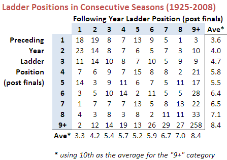
Here's the raw data:

Ladder_Change_Val_25_08.png

(Note that I've grouped all ladder positions of 9th or lower in the "9+" category. In some years this incorporates just two ladder positions, in others as many as eight.)

A few things are of note in this table:

  • Losing Grand Finalists are more likely than winning Grand Finalists to win in the next season.
  • Only 10 of 83 winning Grand Finalists finished 6th or lower in the previous season.
  • Only 9 of 83 winning Grand Finalists have finished 7th or lower in the subsequent season.
  • The average ladder position of a team next season is highly correlated with its position in the previous season. One notable exception to this tendency is for teams finishing 4th. Over one quarter of such teams have finished 9th or worse in the subsequent season, which drags their average ladder position in the subsequent year to 5.8, below that of teams finishing 5th.
  • Only 2 teams have come from 9th or worse to win the subsequent flag - Adelaide, who won in 1997 after finishing 12th in 1996; and Geelong, who won in 2007 after finishing 10th in 2006.
  • Teams that finish 5th have a 14-3 record in Grand Finals that they've made in the following season. In percentage terms this is the best record for any ladder position.

Here's the same data converted into row percentages.

Ladder_Change_PC_25_08.png

Looking at the data in this way makes a few other features a little more prominent:

  • Winning Grand Finalists have about a 45% probability of making the Grand Final in the subsequent season and a little under a 50% chance of winning it if they do.
  • Losing Grand Finalists also have about a 45% probability of making the Grand Final in the subsequent season, but they have a better than 60% record of winning when they do.
  • Teams that finish 3rd have about a 30% chance of making the Grand Final in the subsequent year. They're most likely to be losing Grand Finalists in the next season.
  • Teams that finish 4th have about a 16% chance of making the Grand Final in the subsequent year. They're most likely to finish 5th or below 8th. Only about 1 in 4 improve their ladder position in the ensuing season.
  • Teams that finish 5th have about a 20% chance of making the Grand Final in the subsequent year. These teams tend to the extremes: about 1 in 6 win the flag and 1 in 5 drops to 9th or worse. Overall, there's a slight tendency for these teams to drop down the ladder.
  • Teams that finish 6th or 7th have about a 20% chance of making the Grand Final in the subsequent year. Teams finishing 6th tend to drop down the ladder in the next season; teams finishing 7th tend to climb.
  • Teams that finish 8th have about a 8.5% chance of making the Grand Final in the subsequent year. These teams tend to climb in the ensuing season.
  • Teams that finish 9th or worse have about a 3.5% chance of making the Grand Final in the subsequent year. They also have a roughly 2 in 3 chance of finishing 9th or worse again.

So, I suppose, relatively good news for Cats fans and perhaps surprisingly bad news for St Kilda fans. Still, they're only statistics.

From One Year To The Next: Part 1

With Carlton and Essendon currently sitting in the top 8, I got to wondering about the history of teams missing the finals in one year and then making it the next. For this first analysis it made sense to choose the period 1997 to 2008 as this is the time during which we've had the same 16 teams as we do now.

For that period, as it turns out, the chances are about 1 in 3 that a team finishing 9th or worse in one year will make the finals in the subsequent year. Generally, as you'd expect, the chances improve the higher up the ladder that the team finished in the preceding season, with teams finishing 11th or higher having about a 50% chance of making the finals in the subsequent year.

Here's the data I've been using for the analysis so far:

Ladder_Change_Val_97_08.png

And here's that same data converted into row percentages and grouping the Following Year ladder positions.

Ladder_Change_PC_97_08.png

Note that in these tables I've used each team's final ladder position, not their ladder position as at the end of the home and away season. So, for example, Geelong's 2008 ladder position would be 2nd, not 1st.

Teams that make the finals in a given year have about a 2 in 3 chance of making the finals in the following year. Again, this probability tends to increase with higher ladder position: teams finishing in the top 4 places have a better than 3 in 4 record for making the subsequent year's finals.

One of the startling features of these tables is just how much better flag winners perform in subsequent years than do teams from any other position. In the first table, under the column headed "Ave" I've shown the average next-season finishing position of teams finishing in any given position. So, for example, teams that win the flag, on average, finish in position 3.5 on the subsequent year's ladder. This average is bolstered by the fact that 3 of the 11 (or 27%) premiers have gone back-to-back and 4 more (another 36%) have been losing Grand Finalists. Almost 75% have finished in the top 4 in the subsequent season.

Dropping down one row we find that the losing Grand Finalist from one season fares much worse in the next season. Their average ladder position is 6.6, which is over 3 ladder spots lower than the average for the winning Grand Finalist. Indeed, 4 of the teams that finished 2nd in one season missed the finals in the subsequent year. This is true of only 1 winning Grand Finalist.

In fact, the losing Grand Finalists don't tend to fare any better than the losing Preliminary Finalists, who average positions 6.0 (3rd) and 6.8 (4th).

The next natural grouping of teams based on average ladder position in the subsequent year seems to be those finishing 5th through 11th. Within this group the outliers are teams finishing 6th (who've tended to drop 3.5 places in the next season) and teams finishing 9th (who've tended to climb 1.5 places).

The final natural grouping includes the remaining positions 12th through 16th. Note that, despite the lowly average next-year ladder positions for these teams, almost 15% have made the top 4 in the subsequent year.

A few points of interest on the first table before I finish:

  • Only one team that's finished below 6th in one year has won the flag in the next season: Geelong, who finished 10th in 2006 and then won the flag in 2007
  • The largest season-to-season decline for a premier is Adelaide's fall from the 1998 flag to 13th spot in 1999.
  • The largest ladder climb to make a Grand Final is Melbourne's rise from 14th in 1999 to become losing Grand Finalists to Essendon in 2000.

Next time we'll look at a longer period of history.

Does Losing Lead to Winning?

I was reading an issue of Chance News last night and came across the article When Losing Leads to Winning. In short, the authors of this journal article found that, in 6,300 or so most recent NCAA basketball games, teams that trailed by 1 point at half-time went on to win more games than they lost. This they attribute to "the motivational effects of being slightly behind".

Naturally, I wondered if the same effect existed for footy.

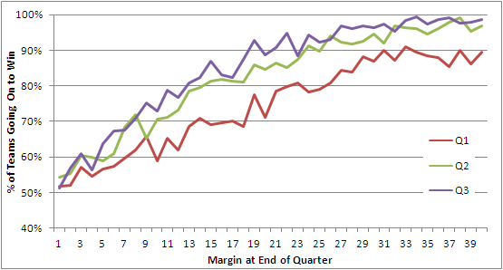
This first chart looks across the entire history of the VFL/AFL.

Leads and Winning - All Seasons.png

The red line charts the percentage of times that a team leading by a given margin at quarter time went on to win the game. You can see that, even at the leftmost extremity of this line, the proportion of victories is above 50%. So, in short, teams with any lead at quarter time have tended to win more than they've lost, and the larger the lead generally the greater proportion they've won. (Note that I've only shown leads from 1 to 40 points.)

Next, the green line charts the same phenomenon but does so instead for half-time leads. It shows the same overall trend but is consistently above the red line reflecting the fact that a lead at half-time is more likely to result in victory than is a lead of the same magnitude at quarter time. Being ahead is important; being ahead later in the game is more so.

Finally, the purple line charts the data for leads at three-quarter time. Once again we find that a given lead at three-quarter time is generally more likely to lead to victory than a similar lead at half-time, though the percentage point difference between the half-time and three-quarter lines is much less than that between the half-time and first quarter lines.

For me, one of the striking features of this chart is how steeply each line rises. A three-goal lead at quarter time has, historically, been enough to win around 75% of games, as has a two-goal lead at half-time or three-quarter time.

Anyway, there's no evidence of losing leading to winning if we consider the entire history of footy. What then if we look only at the period 1980 to 2008 inclusive?

Leads and Winning - 1980 to 2008.png

Now we have some barely significant evidence for a losing leads to winning hypothesis, but only for those teams losing by a point at quarter time (where the red line dips below 50%). Of the 235 teams that have trailed by one point at quarter time, 128 of them or 54.5% have gone on to win. If the true proportion is 50%, the likelihood of obtaining by chance a result of 128 or more wins is about 8.5%, so a statistician would deem that "significant" only if his or her preference was for critical values of 10% rather than the more standard 5%.

There is certainly no evidence for a losing leads to winning effect with respect to half-time or three-quarter time leads.

Before I created this second chart my inkling was that, with the trend to larger scores, larger leads would have been less readily defended, but the chart suggests otherwise. Again we find that a three-goal quarter time lead or a two-goal half-time or three-quarter time lead is good enough to win about 75% of matches.

Not content to abandon my preconception without a fight, I wondered if the period 1980 to 2008 was a little long and that my inkling was specific to more recent seasons. So, I divided up the 112-season history in 8 equal 14-year epochs and created the following table.

Leads and Winning - Table.png

The top block summarises the fates of teams with varying lead sizes, grouped into 5-point bands, across the 8 epochs. For example, teams that led by 1 to 5 points in any game played in the 1897 to 1910 period went on to win 55% of these games. Looking across the row you can see that this proportion has varied little across epochs never straying by more than about 3 percentage points from the all-season average of 54%.

There is some evidence in this first block that teams in the most-recent epoch have been better - not, as I thought, worse - at defending quarter time leads of three goals or more, but the evidence is slight.

Looking next at the second block there's some evidence of the converse - that is, that teams in the most-recent epoch have been poorer at defending leads, especially leads of a goal or more if you adjust for the distorting effect on the all-season average of the first two epochs (during which, for example, a four-goal lead at half-time should have been enough to send the fans to the exits).

In the third and final block there's a little more evidence of recent difficulty in defending leads, but this time it only relates to leads less than two goals at the final change.

All in all I'd have to admit that the evidence for a significant decline in the ability of teams to defend leads is not particularly compelling. Which, of course, is why I build models to predict football results rather than rely on my own inklings ...

Pointless v St Kilda

The Swans' 2nd and 3rd quarter performances last Saturday should not go unremarked.

In the 3rd quarter they failed to register a point, which is a phenomenon that's occurred in only 1.2% of all quarters ever played and in just 0.3% of quarters played since and including the 1980 season. Indeed, so rare is it that only one occurrence has been recorded in each of the last two seasons.

Last year, Melbourne racked up the season's duck egg in the 1st quarter of their Round 19 clash against Geelong, leaving them trailing 0.0 to 8.5 at the first change and in so doing setting a new standard for rapidity in disillusioning Heritage Fund Investors. In 2007 the Western Bulldogs were the team who failed to trouble the goal umpire for an entire quarter - the 2nd quarter of their Round 22 game against the Kangaroos.

So, let's firstly salute the rarity that is failing to score for an entire quarter.

But the Swans did more than this. They preceded their scoreless quarter with a quarter in which they kicked just two behinds. Stringing together successive quarters that, combined, yield two points or fewer is a feat that's been achieved only 175 times in the entire history of the game, and 140 of those were recorded in the period from 1897 to 1918.

Across the last 30 seasons only 12 teams have managed such frugality in front of goal. Prior to the Swans, the most recent example was back in Round 14 of 2002 when West Coast went in at half-time against Geelong having scored 4.7 and headed to the sheds a bit over an hour later having scored just two behinds in the 3rd quarter and nothing at all in the 4th. That makes it almost 6-and-a-half seasons since anyone has done what the Swans did on Saturday.

Prior to the Eagles we need to reach back to Round 4 of 1999 when Essendon - playing West Coast as it happens - finished the 1st quarter and the half stuck at 2.2 and then managed just two behinds in the 3rd term. (They went on to record only two more scoring shots in the final term but rather spoiled things by making one of them a major.)

If you saw the Swans games then, you witnessed a little piece of history.

Waiting on Line

Hmmm. (Just how many ms are there in that word?)

It's Tuesday evening around 7pm and there's still no Line market up on TAB Sportsbet. In the normal course this market would go up at noon on Monday, and that's when the first match is on Friday night. So, this week the first game is 24 hours earlier than normal and the Line market looks as though it'll be delayed by 48 hours, perhaps more.

Curiouser still is the fact that the Head-to-Head market has been up since early March (at least) and there's an historical and strong mathematical relationship between Head-to-Head prices and the Line market, as the following chart shows.

Points_Start.png

The dark line overlaid on the chart fits the empirical data very well. As you can see, the R-squared is 0.944, which is an R-squared I'd be proud to present to any client.

Using the fitted equation gives the following table of Favourite's Price and Predicted Points Start:

Points_Start_Table.png

Anyway, back to waiting for the TAB to set the terms of our engagement for the weekend ...